Stat-Ease Blog

Categories
Mixture Designs – Gimmick or Magic?
Years ago, I attended Stat-Ease’s Modern DOE workshop in Minneapolis—a five day deep dive into factorial and response surface methods (RSM). I then completed a four day course on Mixture Design for Optimal Formulations. Since then, I’ve trained practitioners and coached users through hundreds of experiments. One pattern is consistent: most people—myself included—gravitate toward familiar factorial or RSM designs and hesitate to use mixture designs for formulation work.
The result is force-fitting RSM tools onto mixture problems. Like using a flathead screwdriver on a Phillips screw, it can work, but it’s rarely ideal. And, avoiding mixture designs can actually create real problems. So, what makes mixtures unique, and what goes wrong when we ignore that?
Why Mixtures Are Different
In mixtures, ratios drive responses, not absolute amounts. The flavor of a cookie depends on the ratio of flour, sugar, fat, and salt; not the grams of sugar alone. And because mixture components must sum to a total (often 100%), choosing levels for some ingredients automatically constrains the rest.
The Ratio Workaround—and Its Limits
A common workaround is to convert a q-component mixture into q-1 ratios and run a standard RSM design¹. For example, suppose we’re formulating a sweetener blend (A = sugar, B = corn syrup, C = honey) that always makes up 10% of a cookie recipe. If we express the system using ratios B:A and C:A, we can build a two factor RSM design with ratio levels like 1:1, 2:1, and 3:1.
But compared to a true three component mixture design, the difference is clear. The ratio based design samples only narrow rays of the mixture space, leaving large regions unexplored. Standard error plots show that a proper mixture design provides far better prediction capability across the full region.
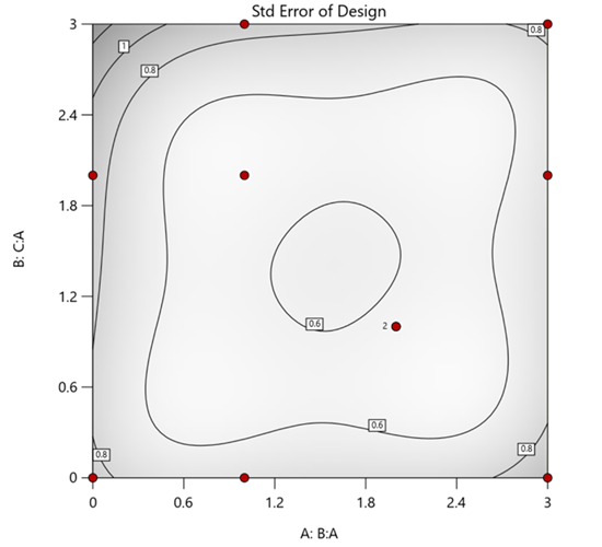
Figure 1. Optimal 10-run RSM design layout using two ratios for a three-component mixture. The shading conveys the relative standard error: lighter is lower, darker is higher.
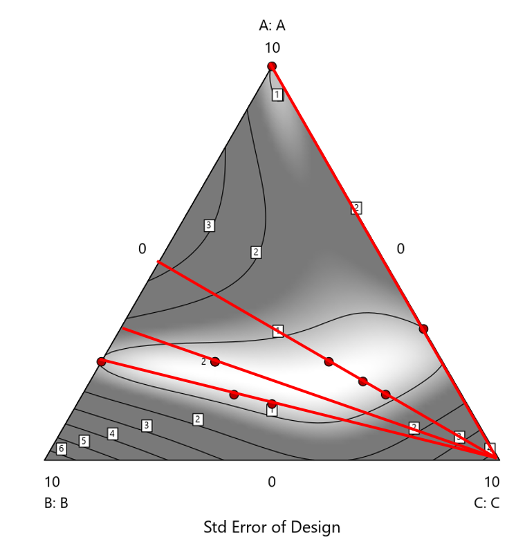
Figure 2. Translation of the ratio design from Figure 1 onto a three-component layout.
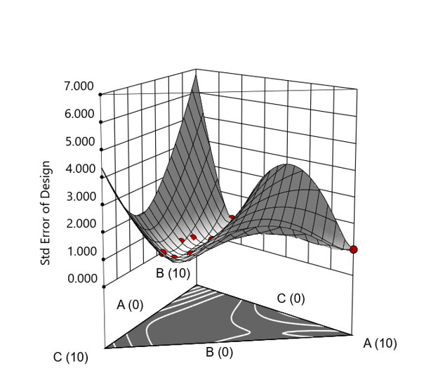
Figure 3. Standard error 3D plot of the 10-run ratio design.
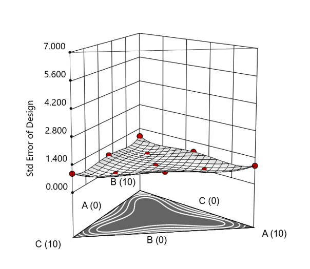
Figure 4. Standard error 3D plot for a 10-run augmented simplex mixture design.
In short: the ratio trick can work, but it never matches the statistical properties of a proper mixture design.
The Slack Component Argument
Another justification for using RSM is when one ingredient is believed to be inconsequential. Perhaps the component is believed to be inert or is simply a diluent that makes up the balance of a formulation. The idea is to treat this component as a slack variable and allow it to fill whatever space remains after setting the other ingredients. One slack approach is to simply use the upper and lower values as levels of the non slack components in a standard RSM. Below is a comparison of a three-component system analyzed as a true mixture design alongside a two-factor RSM that eliminates the diluent as a component.
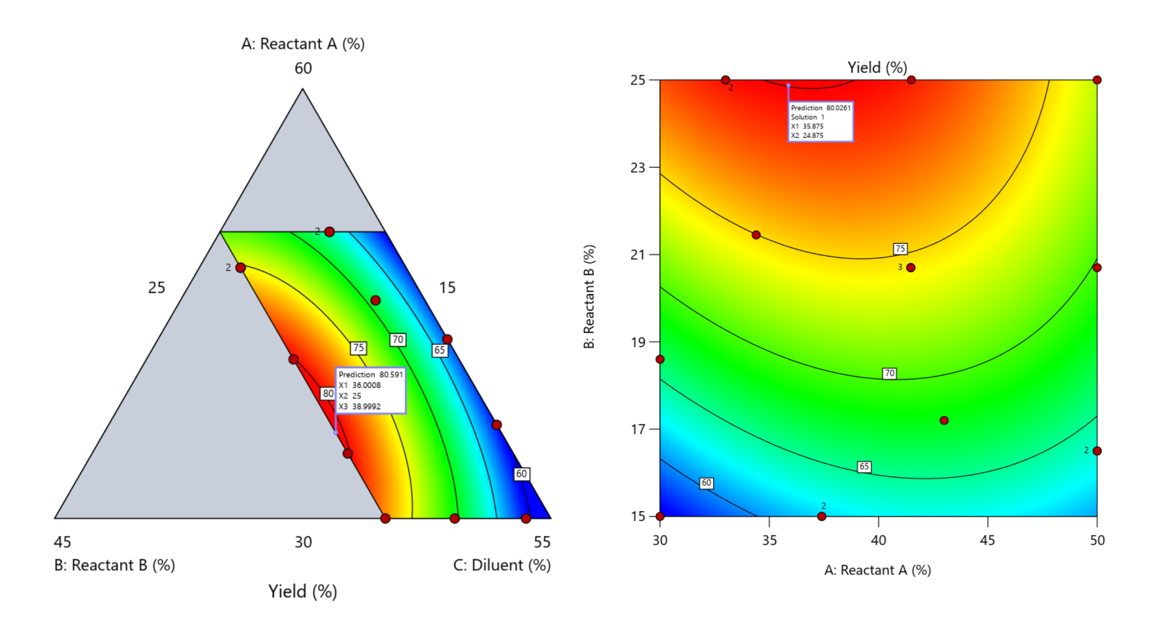
Figure 5. Optimization comparison of a three component mixture design and a two factor (component) RSM approach
In this case, both approaches found essentially the same optimal conditions. Ignoring the diluent really didn’t impact the story, but the RSM approach is not specifically assessing the interactive behavior between the reactants and the diluent. If we study the system as an RSM, we assume the interactions involving the omitted component were not consequential—which may not be true. Cornell² states that the factor effects we are seeing are actually the effects confounded with the opposite effect of the ignored component. Without using a mixture design, we would have no way of validating our assumptions about these interactions.
Cornell³ also describes an alternative slack approach where the slack component is included in the design but excluded from the predictive model. Some practitioners believe this approach makes sense when the diluent interacts weakly with the key ingredients, the omitted component is the one with the widest range of proportionate values, or if that component makes up the bulk of the formulation. But statistically, this presents some interesting complexities.
Using the above chemical reaction example, Figure 6 shows the model differences between the Scheffé approach and the resulting models when each component is considered the slack component.
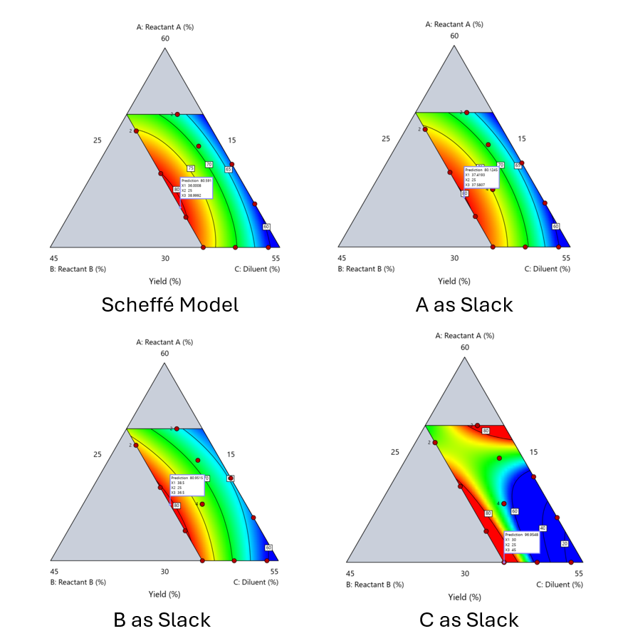
Figure 6. Comparing the Scheffé and Slack modeling techniques.
Note that in this example, while some of the models are similar, the one involving the diluent as the slack variable differs most from the Scheffé standard. Had we assumed the diluent could have been used as the slack variable, we would have poorly modeled and optimized the system.
Because slack variable models exclude at least one component and its interactions, they’re best avoided when possible.
When Components Don’t Share a Scale
Mixture designs require all components to share a common basis (percent, ppm, etc.). This becomes awkward when ingredients span vastly different scales—for example, large amounts of reactants plus a catalyst at ppm levels. The phenomenon is often called the “sliver effect” because the design space becomes a very narrow region for the low-level component, as shown in Figure 7.
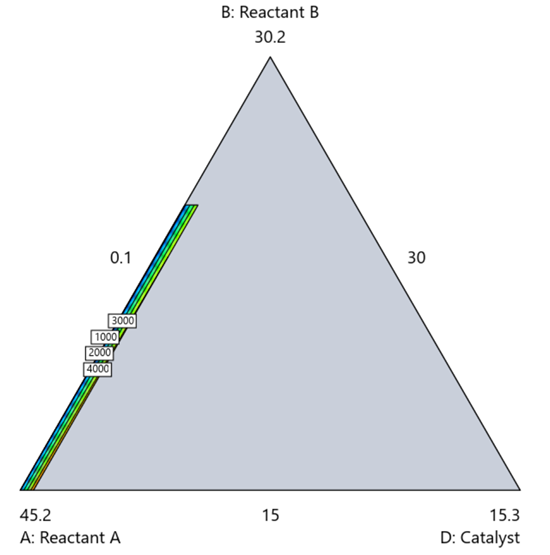
Figure 7. The sliver effect that can occur when one component is present in much lower levels than the balance of the formulation.
One way to avoid a sliver is to change the metric: in this case, changing to molar percent may put the components on a comparable basis and all components could have been included in the mixture design. Or, if I’m still avoiding mixtures, a practical solution is a combined design: treat the main ingredients as a mixture and the catalyst as a process variable. Both the mixture and the catalyst should be modeled quadratically to capture interactions. However, the interactive nature of components is best resolved when all ingredients are included in the mixture design.
The Bottom Line
For formulations, and recipes, the best results come from designs built specifically for mixtures. They’re not gimmicks or magic; they’re the right tools for the job. Stat-Ease provides tutorials and webinars to help you get started:
- A Crash Course in Mixture Design of Experiments
- Optimal experiment designs that combine mixture, process and categorical inputs
Or, if you’d prefer a hands-on, instructor-led experience (maybe with me!), sign up for one of the following courses:
References:
- Response Surface Methodology, 4th edition, Myers, Montgomery, Anderson-Cook, pp. 759-763 (Wiley).
- Experiments with Mixtures, 3rd edition, John Cornell, p. 16 (Wiley).
- Experiments with Mixtures, 3rd edition, John Cornell, p. 333-343 (Wiley).
Like the blog? Never miss a post - sign up for our blog post mailing list.
Mastering mixture modeling
Mixture models (also known as "Scheffé," after the inventor) differ from standard polynomials by their lack of intercept and squared terms. For example, most of us learned about quadratic models in high school and/or college math classes, such as this one for two factors:
These models are extremely useful for optimizing processes via response surface methods (RSM) such as central composite designs (CCDs).
Mixture models look different. For example, consider this non-linear blending model for the melting point (Y) of copper (X₁) and gold (X₂) derived from a statistically designed mixture experiment*:
As you can see, this equation, set up to work with components coded on a 0 to 1 scale, does not include an intercept (ß₀) or squared terms (X₁², X₂²). However, it works quite well for predicting the behavior of a two-component mixture. The first-order coefficients, 1043 and 1072, are quite simple to interpret—these fitted values quantify the measured** melting points in degrees C for copper and gold, respectively. The difference of 29 characterizes the main-component effect (copper 29 degrees higher than gold).
The second-order coefficient of 536 is a bit trickier to interpret. It being negative characterizes the counterintuitive (other than for metallurgists) nonlinear depression of the melting point at a 50/50 composition of the metals. But be careful when quantifying the reduction in the melting: It is far less than you might think. Figure 1 tells the story.
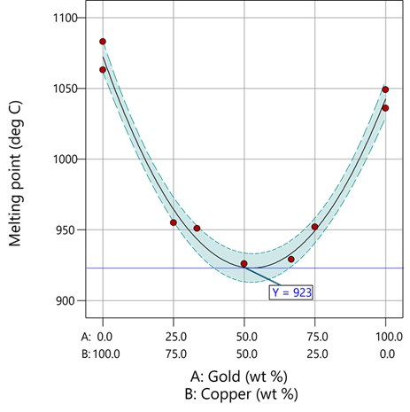
Figure 1: Response surface for melting point of copper versus gold
First off, notice that the left side—100% copper—is higher than the right side—100% gold. This is caused by the main-component effect. Then observe the big dip in the middle created by a significant, second-order impact from non-linear blending. Because of this, the melting point reaches a minimum of 923 degrees C at and just beyond the 50/50 blend point. This falls 134 degrees below the average melting point of 1057 degrees. Given the coefficient of -536 on the X₁X₂ term, you probably expected a much bigger reduction. It turns out 541 divided by 4 equals 134. This is not coincidental—at the 50/50 blend point the product of the coded values reaches a maximum of 0.25 (0.5 x 0.5), and thus the maximum deflection is one-fourth (1/4) of the coefficient.
If your head is spinning at this point, I advise you not to attempt to interpret coefficients of the mixture model beyond the main component effects and, if significant, only the sign of the second-order, non-linear blending term, that is, whether it is positive or negative. Then after validating your model via Stat-Ease software diagnostics, visualize the model performance via our program’s wonderful model graphics—trace plot, 2D contour, and 3D surface. Follow up by doing a numeric optimization to pinpoint an optimum blend that meets all your requirements.
However, if you would like to truly master mixture modeling, come to our next Fundamentals of Mixture DOE workshop.
* For the raw data, see Table 1-1 of A Primer on Mixture Design: What’s in it for Formulators. Due to a more precise fitting, the model coefficients shown in this blog differ slightly from those presented in the Primer.
** Keep in mind these are results from an experiment and thus subject to the accuracy and precision of the testing and the purity of the metals—the theoretical melting points for pure gold and copper are 1064 and 1085 degrees C, respectively.
Like the blog? Never miss a post - sign up for our blog post mailing list.
Hear Ye, Hear Ye: A Response Surface Method (RSM) Experiment on Sound Produces Surprising Results
A few years ago, while evaluating our training facility in Minneapolis, I came up with a fun experiment that demonstrates a great application of RSM for process optimization. It involves how sound travels to our students as a function of where they sit. The inspiration for this experiment came from a presentation by Tom Burns of Starkey Labs to our 5th European DOE User Meeting. As I reported in our September 2014 Stat-Teaser, Tom put RSM to good use for optimizing hearing aids.
Background
Classroom acoustics affect speech intelligibility and thus the quality of education. The sound intensity from a point source decays rapidly by distance according to the inverse square law. However, reflections and reverberations create variations by location for each student—some good (e.g., the Whispering Gallery at Chicago Museum of Science and Industry—a very delightful place to visit, preferably with young people in tow), but for others bad (e.g., echoing). Furthermore, it can be expected to change quite a bit from being empty versus fully occupied. (Our then-IT guy Mike, who moonlights as a sound-system tech, called these—the audience, that is—“meat baffles”.)
Sound is measured on a logarithmic scale called “decibels” (dB). The dBA adjusts for varying sensitivities of the human ear.
Frequency is another aspect of sound that must be taken into account for acoustics. According to Wikipedia, the typical adult male speaks at a fundamental frequency from 85 to 180 Hz. The range for a typical adult female is from 165 to 255 Hz.
Procedure

Stat-Ease training room at one of our old headquarters—sound test points spotted by yellow cups.
This experiment sampled sound on a 3x3 grid from left to right (L-R, coded -1 to +1) and front to back (F-B, -1 to +1)—see a picture of the training room above for location—according to a randomized RSM test plan. A quadratic model was fitted to the data, with its predictions then mapped to provide a picture of how sound travels in the classroom. The goal was to provide acoustics that deliver just enough loudness to those at the back without blasting the students sitting up front.
Using sticky notes as markers (labeled by coordinates), I laid out the grid in the Stat-Ease training room across the first 3 double-wide-table rows (4th row excluded) in two blocks:
- 2² factorial (square perimeter points) with 2 center points (CPs).
- Remainder of the 32 design (mid-points of edges) with 2 additional CPs.
I generated sound from the Online Tone Generator at 170 hertz—a frequency chosen to simulate voice at the overlap of male (lower) vs female ranges. Other settings were left at their defaults: mid-volume, sine wave. The sound was amplified by twin Dell 6-watt Harman-Kardon multimedia speakers, circa 1990s. They do not build them like this anymore 😉 These speakers reside on a counter up front—spaced about a foot apart. I measured sound intensity on the dBA scale with a GoerTek Digital Mini Sound Pressure Level Meter (~$18 via Amazon).
Results
I generated my experiment via the Response Surface tab in Design-Expert® software (this 3³ design shows up under "Miscellaneous" as Type "3-level factorial"). Via various manipulations of the layout (not too difficult), I divided the runs into the two blocks, within which I re-randomized the order. See the results tabulated below.
| Block | Run | Space Type | Coordinate (A: L-R) | Coordinate (B: F-B) | Sound (dBA) |
|---|---|---|---|---|---|
| 1 | 1 | Factorial | -1 | 1 | 70 |
| 1 | 2 | Center | 0 | 0 | 58 |
| 1 | 3 | Factorial | 1 | -1 | 73.3 |
| 1 | 4 | Factorial | 1 | 1 | 62 |
| 1 | 5 | Center | 0 | 0 | 58.3 |
| 1 | 6 | Factorial | -1 | -1 | 71.4 |
| 1 | 7 | Center | 0 | 0 | 58 |
| 2 | 8 | CentEdge | -1 | 0 | 64.5 |
| 2 | 9 | Center | 0 | 0 | 58.2 |
| 2 | 10 | CentEdge | 0 | 1 | 61.8 |
| 2 | 11 | CentEdge | 0 | -1 | 69.6 |
| 2 | 12 | Center | 0 | 0 | 57.5 |
| 2 | 13 | CentEdge | 1 | 0 | 60.5 |
Notice that the readings at the center are consistently lower than around the edge of the three-table space. So, not surprisingly, the factorial model based on block 1 exhibits significant curvature (p<0.0001). That leads to making use of the second block of runs to fill out the RSM design in order to fit the quadratic model. I was hoping things would play out like this to provide a teaching point in our DOESH class—the value of an iterative strategy of experimentation.
The 3D surface graph shown below illustrates the unexpected dampening (cancelling?) of sound at the middle of our Stat-Ease training room.
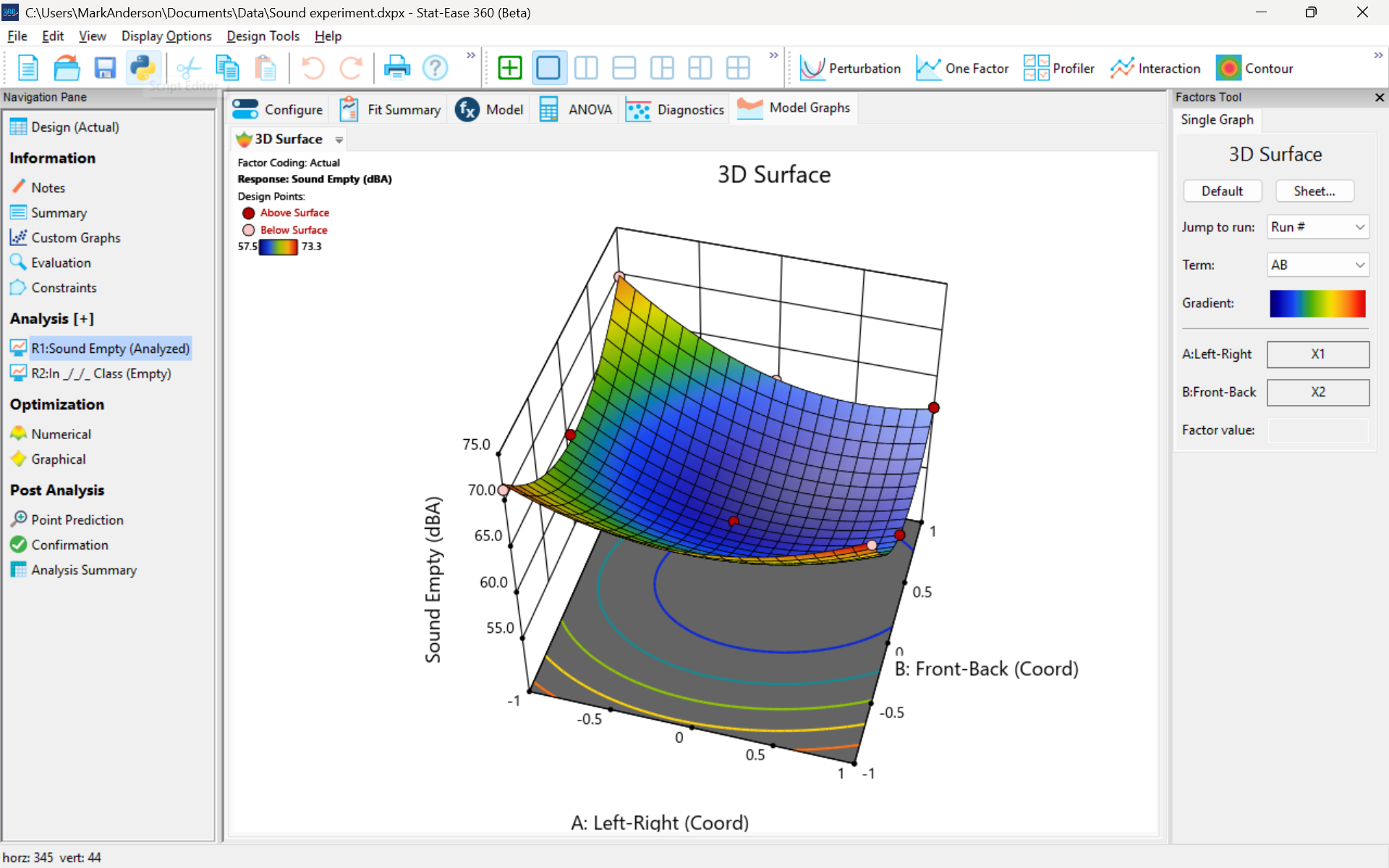
3D surface graph of sound by classroom coordinate.
Perhaps this sound ‘map’ is typical of most classrooms. I suppose that it could be counteracted by putting acoustic reflectors overhead. However, the minimum loudness of 57.4 (found via numeric optimization and flagged over the surface pictured) is very audible by my reckoning (having sat in that position when measuring the dBA). It falls within the green zone for OSHA’s decibel scale, as does the maximum of 73.6 dBA, so all is good.
What next
The results documented here came from an empty classroom. I would like to do it again with students (aka meat baffles) present. I wonder how that will affect the sound map. Of course, many other factors could be tested. For example, Rachel from our Front Office team suggested I try elevating the speakers. Another issue is the frequency of sound emitted. Furthermore, the oscillation can be varied—sine, square, triangle and sawtooth waves could be tried. Other types of speakers would surely make a big difference.
What else can you think of to experiment on for sound measurement? Let me know.
Like the blog? Never miss a post - sign up for our blog post mailing list.
Are optimal response surface method (RSM) designs always the optimal choice?
Most people who have been exposed to design of experiment (DOE) concepts have probably heard of factorial designs—designs that target the discovery of factor and interaction effects on their process. But factorial designs are hardly the only tool in the shed. And oftentimes to properly optimize our system a more advanced response surface design (RSM) will prove to be beneficial, or even essential.
This is the case when there is “curvature” within the design space, suggesting that quadratic (or higher) order terms are needed to make valid predictions between the extreme high/low process factor settings. This gives us the opportunity to find optimal solutions that reside in the interior of the design space. If you include center points in a factorial design, you can check for non-linear behavior within the design space to see if an RSM design would be useful (1). But which RSM options should you pick?
Let’s start by introducing the Stat-Ease® software menu options for RSM designs. Once we understand the alternatives we can better understand when which might be most useful for any given situation and why optimal designs are great—when needed.
- First on the list is the central composite design (our software default)
- Next is the Box-Behnken design
- And third is something called optimal design
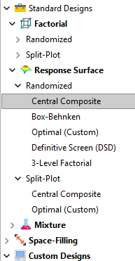
Stat-Ease software design selection options
The natural question that often pops up is this. Since optimal designs are third on our list, are we defaulting to suboptimal designs? Let’s dig in a bit deeper.
The central composite design (“CCD”) has traditionally been the workhorse of response surface methods. It has a predictable structure (5 levels for each factor). It is robust to some variations in the actual factor settings, meaning that you will still get decent quadratic model fits even if the axial runs have to be tweaked to achieve some practical values, including the extreme case when the axial points are placed at the face of the factorial “cube” making the design a 3-level study. A CCD is the design of choice when it fits the problem and generally creates predictive models that are effective throughout the design space--the factorial region of the design. Note that the quadratic predictive models generally improve when the axial points reside outside the face of the factorial cube.
When a 5-level study is not practical, for example, if we are looking at catalyst levels and the lower axial point would be zero or a negative number, we may be forced to bring the axial points to the face of the factorial cube. When this happens, Box-Behnken designs would be another standard design to consider. It is a 3-level design that is laid out slightly differently than a CCD. In general, the Box-Behnken results in a design with marginally fewer runs and is generally capable of creating very useful quadratic predictive models.
These standard designs are very effective when our experiments can be performed precisely as scripted by the design template. But this is not always the case, and when it is not we will need to apply a more novel approach to create a customized DOE.
Optimal designs are “custom” creations that come in a variety of alphabet-soup flavors—I, D, A, G, etc. The idea with optimal designs is that given your design needs and run-budget, the optimization algorithm will seek out the best choice of runs to provide you with a useful predictive model that is as effective as possible. Use of the system defaults when creating optimal designs is highly advised. Custom optimal designs often have fewer runs than the central composite option. Because they are generated by a computer algorithm, the number of levels per factor and the positioning of the points in the design space may be unique each time the design is built. This may make newcomers to optimal designs a bit uneasy. But, optimal designs fill the gap when:
- The design space is not “cuboidal”— there are constraints on the operating region that make the design space lopsided or truncated.
- There are categoric or discrete numeric factors to deal with.
- The expected polynomial model is something other than a full quadratic.
- You are trying to augment an existing design to expand the design space or to upgrade to a higher order model.
The classic designs provide simple and robust solutions and should always be considered first when planning an experiment. However, when these designs don’t work well because of budget or practical design space constraints, don’t be afraid to go “outside the box” and explore your other options. The goal is to choose a design that fits the problem!
Acknowledgement: This post is an update of an article by Shari Kraber on “Modern Alternatives to Traditional Designs Modern Alternatives to Traditional Designs" published in the April 2011 STATeaser.
(1) See Shari Kraber’s blog post, “"Energize Two-Level Factorials - Add Center Points!” from August. 23, 2018 for additional insights.
Like the blog? Never miss a post - sign up for our blog post mailing list.
January Publication Roundup
Here's the latest Publication Roundup! In these monthly posts, we'll feature recent papers that cited Design-Expert® or Stat-Ease® 360 software. Please submit your paper to us if you haven't seen it featured yet!
Featured Article
Quantification of Menthol by Chromatography Applying Analytical Quality by Design
Chromatographia, Published: 17 January 2026
Authors: Santiago Puentes, Julian Puentes, Ronald Andrés Jiménez & Emerson León Ávila
Mark's comments: Well done deploying the Ishikawa (fishbone) diagram to consider all the factors that might affect the analytical method. This is a great application of a multifactor approach to achieve quality by design.
Be sure to check out this important study, and the other research listed below!
More new publications from January
- UHPLC Method Development for the Trace Level Quantification of Anastrozole and Its Process-Related Impurities Using Design of Experiments
Biomedical Chromatography, Volume 40, Issue 2 February 2026 e70279
Authors: Narasimha Rao Tadisetty, Ramesh Yanamandra, Subhalaxmi Pradhan, Gitanjali Pradhan - Combinatorial Anti-Mitotic Activity of Loratadine/5-Fluorouracil Loaded Zein Tannic Acid Nanoparticles in Breast Cancer Therapy: In silico, in vitro and Cell Studies
International Journal of Nanomedicine, 2026; 21:1-27
Authors: Mohamed Hamdi, Moawia M Al-Tabakha, Isra H Ali, Islam A Khalil - Synergistic effects and optimization of palm oil fuel ash and jute fiber in sustainable concrete
Scientific Reports volume 16, Article number: 259 (2026)
Authors: Muhammad Umer, Nawab Sameer Zada, Paul O. Awoyera, Muhammad Basit Khan, Wisal Ahmed, Olaolu George Fadugba - Harnessing sawdust for clean energy: production and optimization of bioethanol in Nigeria
MOJ Ecology & Environmental Sciences, 2026; 11(1):5‒11.
Authors: Ifeoma Juliet Opara, Eno-obong Sunday Nicholas, Ezekiel Adi Siman - Antibiotic-phytochemical combinations against Enterococcus faecalis: a therapeutic strategy optimized using response surface methodology
Antonie van Leeuwenhoek, 119, 41 (2026)
Authors: Monikankana Dasgupta, Alakesh Maity, Ranojit Kumar Sarker, Payel Paul, Poulomi Chakraborty, Sarita Sarkar, Ritwik Roy, Moumita Malik, Sharmistha Das & Prosun Tribedi - Breakthrough RP-HPLC strategy for synchronous analysis of pyridine and its degradation products in powder for injection using quality metrics
Scientific Reports volume 16, Article number: 1344 (2026)
Authors: Asma S. Al‐Wasidi, Noha S. katamesh, Fahad M. Alminderej, Sayed M. Saleh, Hoda A. Ahmed, Mahmoud A. Mohamed