Stat-Ease Blog

Categories
The Do's and Don'ts for Screening Process Factors
Adapted from Mark Anderson's 2023 webinar, "Do's & Don'ts for Screening Process Factors."
Over the years working with process development engineers on scale-up and manufacturing troubleshooting, we've noticed a pattern: the factors that experts think drive their process are rarely the whole story. There are often other variables at play that nobody anticipates. The best way to uncover these is by using screening designs: broad, shallow experiments that help you uncover previously unknown factors. Done right, a well-designed screening study can transform your understanding of a process and point you directly to the vital few factors worth exploring in depth.
First, let’s make sure we understand what a screening design does in the overall arc of process optimization. Screening designs exist to help ensure we are working with the right factors in subsequent optimization studies. Figure 1 explains the overall strategy. Note that interactions – often the key to process improvement – are not identified until the subsequent step. But a good screening design can shed some light on whether or not there are interactions to further pursue.
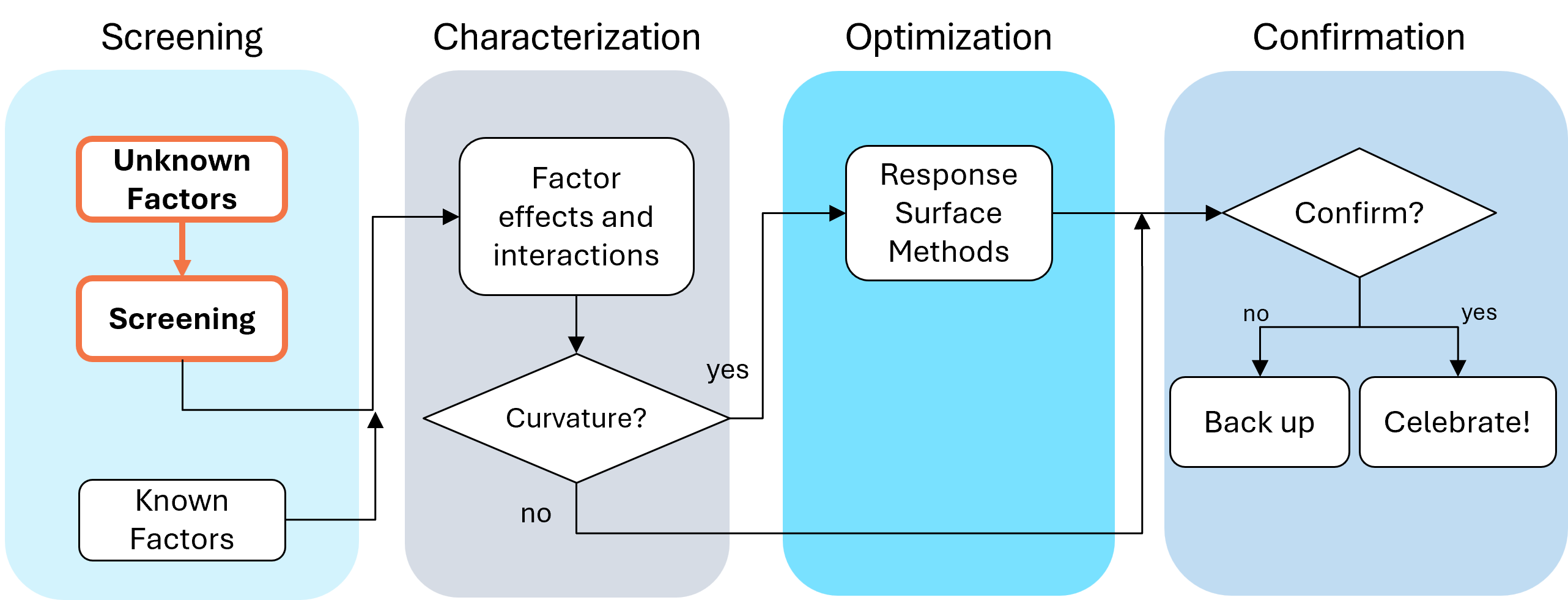
Fig. 1: Where screening fits in the SCOR strategy of experimentation.
With this strategy in view, here are the core do's and don'ts on screening designs. Consider this your field guide for avoiding the most common (and costly) mistakes.
DON'T: Include Factors You Already Know Will Affect the Process
This one surprises a lot of people, and has been the topic of heated discussions within our team. Why would you exclude a known important factor?
The answer is strategic focus and efficiency. By setting known factors aside during screening, you can concentrate on previously unknown factors: ones that might derail your process in unexpected ways. A broad and shallow two-level screening design lets you quickly identify the "vital few" from the "trivial many." In our experience, roughly 20% of factors you didn't expect to matter, matter! The known factors can be merged back in during the next phase of experimentation.
DON'T: Use Low Resolution Designs for Screening
This is our biggest pet peeve. Two types of designs fall into this trap: regular fractional factorials at Resolution III (shown as "red" designs in Stat-Ease software[MA3.1]), which alias main effects directly with two-factor interactions, and Plackett-Burman designs with even worse aliasing. That's a fatal flaw for screening, because if any factors interact (and in real processes, they often do) your main effect estimates are corrupted. You simply cannot trust what the analysis is telling you.
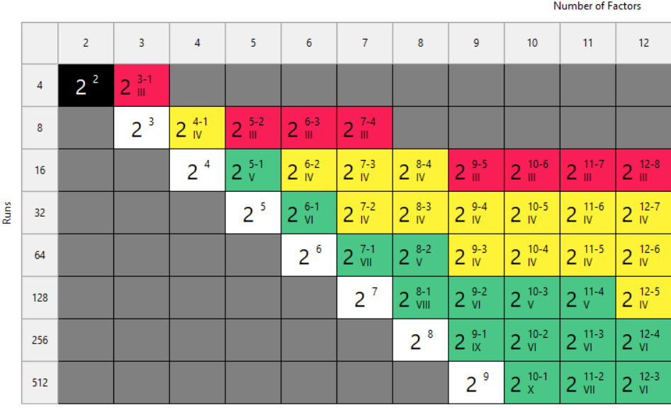
Fig. 2: Stat-Ease software's design picker, color-coded for your convenience.
We're particularly troubled by how often Plackett-Burman designs get recommended for screening. Even the NIST Engineering Statistics Handbook suggests using them, while simultaneously noting that “main effects are in general heavily confounded with two-factor interactions.” To us, that's an oxymoron. If main effects are confounded with two-factor interactions, how exactly is this a screening design? You can’t screen anything out!
To illustrate the danger, we ran a simulation using the classic filtration rate dataset from Doug Montgomery's textbook Design and Analysis of Experiments. The full factorial result was clear: factors A (temperature), C (concentration), and D (stirring rate) were significant, along with strong AC and AD interactions.
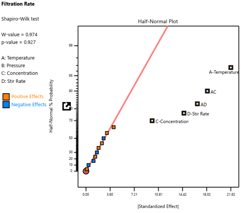
Fig. 3: Half-normal plot of effects for the full factorial design. Note that the selected effects are to well the right of the guideline.
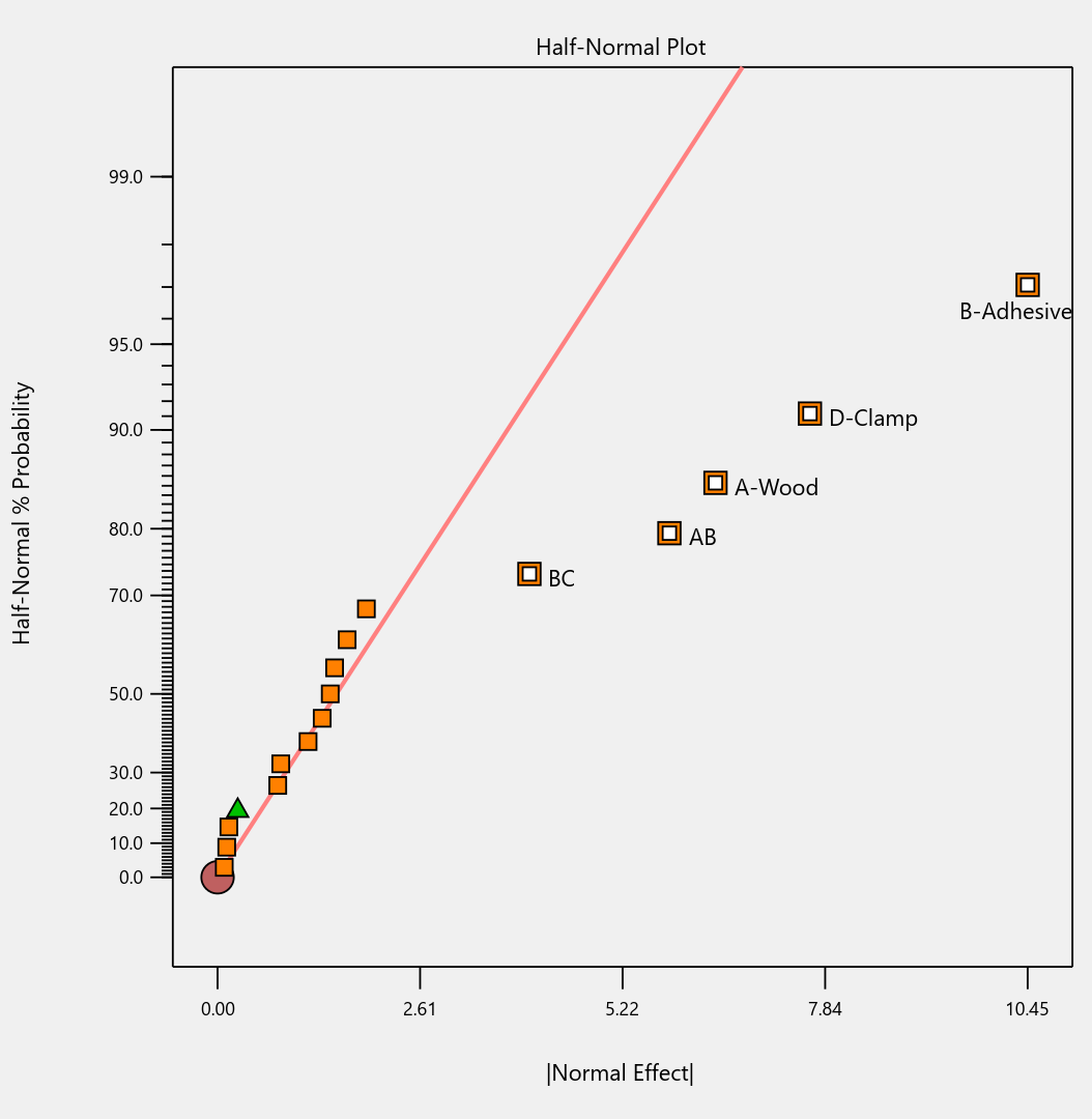
When we re-ran the same underlying model through a 12-run Plackett-Burman simulation, the results were alarming. The AC and AD interactions got “smeared out” across multiple dummy factors. In particular, a fake factor E appeared significant when it was actually picking up aliased pieces of AC and AD. Meanwhile, the real main effect of D was undercut by its aliasing with one-third of AC, causing a cancellation. The result? Only factor A was correctly identified. Factors C and D were missed entirely.
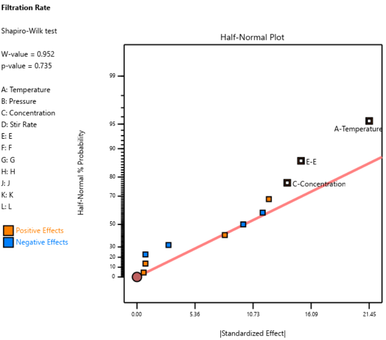
Fig. 4: Half-normal plot of effects for the Plackett-Burman design. None of the effects are to the right of the line, meaning this experiment shows no significant factors or interactions.
DOE pioneer George Box once said that running Resolution III or PB designs are "like kicking the TV to make it work." Sometimes you're desperate enough to try it, but there’s no guarantee you’ll get a usable result.
A Case Study in What NOT to Do
One of our users, a pharmaceutical process developer, sent in his design results hoping we could help salvage them. He had seven factors (time, temperature, and related process variables) and chose a Resolution III design with seven factors in eight runs. This is known as a ‘saturated’ design—the most factors that can be crammed into a given number of runs in a regular fractional factorial. Then, apparently recognizing the power would be low, he replicated the design, giving him 16 runs total, still at Resolution III.
As Ronald Fisher put it, a statistician is more like a pathologist than a medical doctor. We can tell you what killed the patient, but we can't bring it back to life. We wish this researcher had contacted us before running the design. The 16-run Resolution IV option for seven factors was right there in the software, highlighted in yellow (indicating a design more suitable for screening) It would have given him both the power and the resolution he needed. Instead, he replicated a bad design, which is a bit like making a photocopy of a photocopy.
The power calculations for these two designs are the clincher. One replicate of eight runs gave only 50% power to detect his specified signal-to-noise ratio of 1.67. Two replicates (still Resolution III) pushed that to about 87%: good power, terrible resolution. The unreplicated Resolution IV design in 16 runs also reached about 83% power, while giving him a design that could actually distinguish main effects from interactions.
DO: Start with a Resolution IV Design
As stated above, Resolution IV is the “Goldilocks” choice for screening. Main effects are aliased only with three-factor interactions, which are rarely active. That means that any significant main effects detected are almost certainly real. While two-factor interactions in a Res IV design may be murky, you'll know to investigate these further.
In Stat-Ease software, these are the yellow designs in the Regular Two-Level design builder. For up to eight factors, these medium resolution designs work beautifully. For nine or more factors, Stat-Ease’s proprietary, optimally templated, Minimum-Run screening design provides an excellent option when the standard design alternatives get too big.
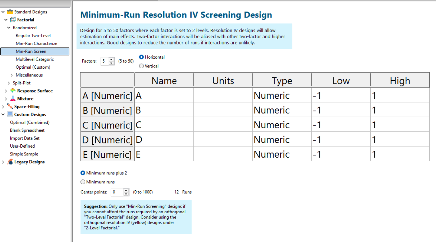
Fig. 5: Min-Run Screening designs in Stat-Ease software. Choose them from the sidebar on the left.
Summary: The Screening Do's and Don'ts
To recap: hold known factors aside during screening and focus on the unknowns. Known factors will be studied together with the survivors of the screening design in the next round of experimentation when characterizing two-factor interactions with high-resolution designs. Avoid low-resolution designs: the red standard ones or Plackett-Burmans. Instead, go with medium Resolution IV or minimum run screening design from the start.
All Stat-Ease software licensees have access to our DOE experts. We encourage you to contact us before making a big mistake in your design of experiments. Don’t hesitate to reach out: do your screening right the first time.
Like the blog? Never miss a post - sign up for our blog post mailing list.
10 highly intelligent features that make the most from every experiment
Stat-Ease software provides powerful tools for design of experiments (DOE) with a great deal of intelligence baked in. Here are 10 “smart” features that make DOE easy for our users. From bottom to top (ordered by DOE phase: design, modeling, optimization, and confirmation), every one of them provides great value.
Here we go—the countdown begins!
- Factorial design-building wizard guides you to right-sized experiments via a ‘heads-up’ on power to detect important effects despite the variability of run, sample, and test.
- Optimal design builder’s exchange algorithm delivers a finely crafted experiment customized per your specifications.
- Preset lineup of near-zero effects on the half-normal graph of factorial effects makes it easy to see those that merit selection.
- Scoring system for polynomial models suggests just the right 'Goldilocks' level that does not underfit or overfit your results.
- Box-Cox plot studies your model residuals and recommends whether or not to apply a transformation for a better fit and advises which one will do best.
- Detection of non-hierarchical models and, if you agree to fix this, the needed terms get added back for a well-formulated polynomial.
- Application of a curvature test to two-level factorial designs with center points with advice on how to augment the design if significant.
- Annotations on statistical outputs that explain them in plain English and provide advice on what to do when they go awry.
- Numerical search using a highly effective variable-size simplex algorithm finds the most desirable combination of factor settings and/or component levels meeting all your goals for process efficiency, product efficacy, and cost reduction.
- Confirmation tool smartly updates the prediction interval based on the number of follow-up runs at your chosen setting.
Finally, one bonus feature in Stat-Ease software that will make you more intelligent: screen tips via the lightbulb icon (click the >> chevron if showing) next to the Help bubble. This will show interesting information about each feature on the screen for you to understand the underlying statistics.
Email me your favorite “they thought of everything” quality aspect of Stat-Ease software, and I will add it to my list for my next ‘shout out’ on intelligent features.
Ask An Expert: Len Rubinstein
Next in our 40th anniversary “Ask an Expert” blog series is Leonard “Len” Rubinstein, a Distinguished Scientist at Merck. He has over 3 decades of experience in the pharmaceutical industry, with a background in immunology. Len has spent the last couple of decades working on bioanalytical development, supporting bioprocess and clinical assay endpoints. He’s also a decades-long proponent of design of experiments (DOE), so we reached out to learn what he has to say!
When did you first learn about DOE? What convinced you to try it?
I first learned about DOE in 1996. I enrolled in a six-day training course to better understand the benefits of this approach in my assay development.
What convinced you to stick with DOE, rather than going back to one-factor-at-a-time (OFAT) designs?
Once I started using the DOE approach, I was able to shorten development time but, more importantly, gained insights into understanding interactions and modeling the results to predict optimal parameters that provided the most robust and least variable bioanalytical methods. Afterward, I could never go back to OFAT!
How do you currently use & promote DOE at your company?
DOE has been used in many areas across the company for years, but it has not been explicitly used for the analytical methods supporting clinical studies. I raised awareness through presentations and some brief training sessions. Afterward, after my management adopted it, I started sponsoring the training. Since 2018, I have sponsored four in-person training sessions, each with 20 participants.
Some examples of where we used DOE can be found at the end of this interview.
What’s been your approach for spreading the word about how beneficial DOE is?
Convincing others to use DOE is about allowing them to experience the benefits and see how it’s more productive than using an OFAT approach. They get a better understanding of the boundaries of the levels of their factors to have little effect on the result and, more importantly, sometimes discard what they thought was an important factor(s) in favor of those that truly influenced their desired outcome.
Is there anything else you’d like to share to further the cause of DOE?
It would be beneficial if our scientists were exposed to DOE approaches in secondary education, be it a BA/BS, MA/MS, or PhD program. Having an introduction better prepares those who go on to develop the foundation and a desire to continue using the DOE approach and honing their skills with this type of statistical design in their method development.
And there you have it! We appreciate Len’s perspective and hope you’re able to follow in his footsteps for experimental success. If you’re a secondary education teacher and want to take Len’s advice about introducing DOE to your students, send us a note: we have “course-in-a-box” options for qualified instructors, and we offer discounts to all academics who want to use Stat-Ease software or learn DOE from us.
Len’s published research:
Whiteman, M.C., Bogardus, L., Giacone, D.G., Rubinstein, L.J., Antonello, J.M., Sun, D., Daijogo, S. and K.B. Gurney. 2018. Virus reduction neutralization test: A single-cell imaging high-throughput virus neutralization assay for Dengue. American Journal of Tropical Medicine and Hygiene. 99(6):1430-1439.
Sun, D., Hsu, A., Bogardus, L., Rubinstein, L.J., Antonello, J.M., Gurney, K.B., Whiteman, M.C. and S. Dellatore. 2021. Development and qualification of a fast, high-throughput and robust imaging-based neutralization assay for respiratory syncytial virus. Journal of Immunological Methods. 494:113054
Marchese, R.D., Puchalski, D., Miller, P., Antonello, J., Hammond, O., Green, T., Rubinstein, L.J., Caulfield, M.J. and D. Sikkema. 2009. Optimization and validation of a multiplex, electrochemiluminescence-based detection assay for the quantitation of immunoglobulin G serotype-specific anti-pneumococcal antibodies in human serum. Clinical and Vaccine Immunology. 16(3):387-396.
Know the SCOR for a winning strategy of experiments
Observing process improvement teams at Imperial Chemical Industries in the late 1940s George Box, the prime mover for response surface methods (RSM), realized that as a practical matter, statistical plans for experimentation must be very flexible and allow for a series of iterations. Box and other industrial statisticians continued to hone the strategy of experimentation to the point where it became standard practice for stats-savvy industrial researchers.
Via their Management and Technology Center (sadly, now defunct), Du Pont then trained legions of engineers, scientists, and quality professionals on a “Strategy of Experimentation” called “SCO” for its sequence of screening, characterization and optimization. This now-proven SCO strategy of experimentation, illustrated in the flow chart below, begins with fractional two-level designs to screen for previous unknown factors. During this initial phase, experimenters seek to discover the vital few factors that create statistically significant effects of practical importance for the goal of process improvement.

The ideal DOE for screening resolves main effects free of any two-factor interactions (2FI’s) in broad and shallow two-level factorial design. I recommend the “resolution IV” choices color-coded yellow on our “Regular Two-Level” builder (shown below). To get a handy (pun intended) primer on resolution, watch at least the first part of this Institute of Quality and Reliability YouTube video on Fractional Factorial Designs, Confounding and Resolution Codes.
If you would like to screen more than 8 factors, choose one of our unique “Min-Run Screen” designs. However, I advise you accept the program default to add 2 runs and make the experiment less susceptible to botched runs.

Stat-Ease® 360 and Design-Expert® software conveniently color-code and label different designs.
After throwing the trivial many factors off to the side (preferably by holding them fixed or blocking them out), the experimental program enters the characterization phase (the “C”) where interactions become evident. This requires a higher-resolution of V or better (green Regular Two-Level or Min-Run Characterization), or possibly full (white) two-level factorial designs. Also, add center points at this stage so curvature can be detected.
If you encounter significant curvature (per the very informative test provided in our software), use our design tools to augment your factorial design into a central composite for response surface methods (RSM). You then enter the optimization phase (the “O”).
However, if curvature is of no concern, skip to ruggedness (the “R” that finalizes the “SCOR”) and, hopefully, confirm with a low resolution (red) two-level design or a Plackett-Burman design (found under “Miscellaneous” in the “Factorial” section). Ideally you then find that your improved process can withstand field conditions. If not, then you will need to go back up to the beginning for a do-over.
The SCOR strategy, with some modification due to the nature of mixture DOE, works equally well for developing product formulations as it does for process improvement. For background, see my October 2022 blog on Strategy of Experiments for Formulations: Try Screening First!
Stat-Ease provides all the tools and training needed to deploy the SCOR strategy of experiments. For more details, watch my January webinar on YouTube. Then to master it, attend our Modern DOE for Process Optimization workshop.
Know the SCOR for a winning strategy of experiments!
Dive into Diagnostics for DOE Model Discrepancies
Note: If you are interested in learning more, and to see these graphs in action, check out this YouTube video “Dive into Diagnostics to Discover Data Discrepancies”
The purpose of running a statistically designed experiment (DOE) is to take a strategically selected small sample of data from a larger system, and then extract a prediction equation that appropriately models the overall system. The statistical tool used to relate the independent factors to the dependent responses is analysis of variance (ANOVA). This article will lay out the key assumptions for ANOVA and how to verify them using graphical diagnostic plots.
The first assumption (and one that is often overlooked) is that the chosen model is correct. This means that the terms in the model explain the relationship between the factors and the response, and there are not too many terms (over-fitting), or too few terms (under-fitting). The adjusted R-squared and predicted R-squared values specify the amount of variation in the data that is explained by the model, and the amount of variation in predictions that is explained by the model, respectively. A lack of fit test (assuming replicates have been run) is used to assess model fit over the design space. These statistics are important but are outside the scope of this article.
The next assumptions are focused on the residuals—the difference between an actual observed value and its predicted value from the model. If the model is correct (first assumption), then the residuals should have no “signal” or information left in them. They should look like a sample of random variables and behave as such. If the assumptions are violated, then all conclusions that come from the ANOVA table, such as p-values, and calculations like R-squared values, are wrong. The assumptions for validity of the ANOVA are that the residuals:
- Are (nearly) independent,
- Have a mean = 0,
- Have a constant variance,
- Follow a well-behaved distribution (approximately normal).
Independence: since the residuals are generated based on a model (the difference between actual and predicted values) they are never completely independent. But if the DOE runs are performed in a randomized order, this reduces correlations from run to run, and independence can be nearly achieved. Restrictions on the randomization of the runs degrade the statistical validity of the ANOVA. Use a “residuals versus run order” plot to assess independence.
Mean of zero: due to the method of calculating the residuals for the ANOVA in DOE, this is given mathematically and does not have to be proven.
Constant variance: the response values will range from smaller to larger. As the response values increase, the residuals should continue to exhibit the same variance. If the variation in the residuals increases as the response increases, then this is non-constant variance. It means that you are not able to predict larger response values as precisely as smaller response values. Use a “residuals versus predicted value” graph to check for non-constant variance or other patterns.
Well-behaved (nearly normal) distribution: the residuals should be approximately normally distributed, which you can check on a normal probability plot.
A frequent misconception by researchers is to believe that the raw response data needs to be normally distributed to use ANOVA. This is wrong. The normality assumption is on the residuals, not the raw data. A response transformation such as a log may be used on non-normal data to help the residuals meet the ANOVA assumptions.
Repeating a statement from above, if the assumptions are violated, then all conclusions that come from the ANOVA table, such as p-values, and calculations like R-squared values, are wrong, at least to some degree. Small deviations from the desired assumptions are likely to have small effects on the final predictions of the model, while large ones may have very detrimental effects. Every DOE needs to be verified with confirmation runs on the actual process to demonstrate that the results are reproducible.
Good luck with your experimentation!