New Software Features! What's in it for You?
There are a couple features in the latest release of Design-Expert and Stat-Ease 360 software programs (version 22.0) that I really love, and wanted to draw your attention to. These features are accessible to everyone, no matter if you are a novice or an expert in design of experiments.
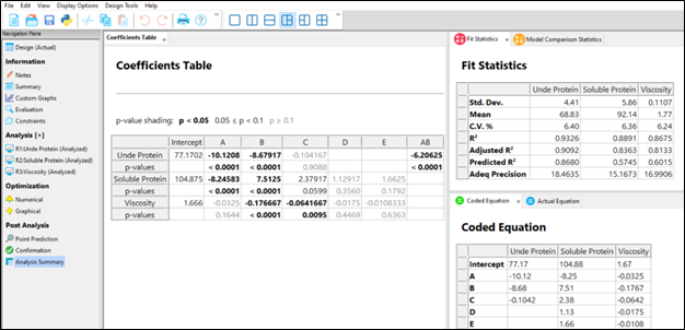
First, the Analysis Summary in the Post Analysis section: This provides a quick view of all response analyses in a set of tables, making it easy to compare model terms, statistics such as R-squared values, equations and more. We are pleased to now have this feature that has been requested many times! When you have a large number of responses, understanding the similarities and differences between the model may lead to additional insights to your product or process.
Second, the Custom Graphs (previously Graph Columns): Functionality and flexibility have been greatly expanded so that you can now plot analysis or diagnostic values, as well as design column information. Customize the colors, shapes and sizes of the points to tell your story in the way that makes sense to your audience.
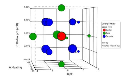
Figure 1 (left) shows the layout of points in a central composite design, where the points are colored by the their space point type (factorial, axial or center points) and then sized by the response value. We can visualize where in the design space the responses are smaller versus larger.
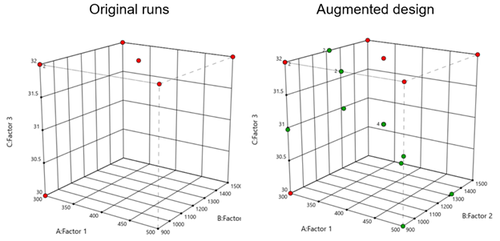
In Figure 2 (right), I had a set of existing runs that I wanted to visualize in the design space. Then I augmented the design with new runs. I set the Color By option to Block to clearly see the new (green) runs that were added to the design space.
These new features offer many new ways to visualize your design, response data, and other pieces of the analysis. What stories will you tell?