Stat-Ease Blog

Categories
Augmenting One-Factor-at-a-Time Data to Build a DOE
I am often asked if the results from one-factor-at-a-time (OFAT) studies can be used as a basis for a designed experiment. They can! This augmentation starts by picturing how the current data is laid out, and then adding runs to fill out either a factorial or response surface design space.
One way of testing multiple factors is to choose a starting point and then change the factor level in the direction of interest (Figure 1 – green dots). This is often done one variable at a time “to keep things simple”. This data can confirm an improvement in the response when any of the factors are changed individually. However, it does not tell you if making changes to multiple factors at the same time will improve the response due to synergistic interactions. With today’s complex processes, the one-factor-at-a-time experiment is likely to provide insufficient information.
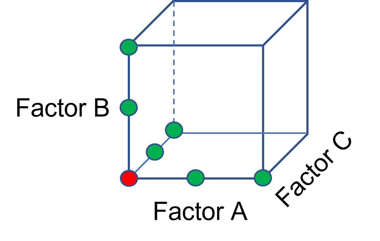
Figure 1: OFAT
The experimenter can augment the existing data by extending a factorial box/cube from the OFAT runs and completing the design by running the corner combinations of the factor levels (Figure 2 – blue dots). When analyzing this data together, the interactions become clear, and the design space is more fully explored.
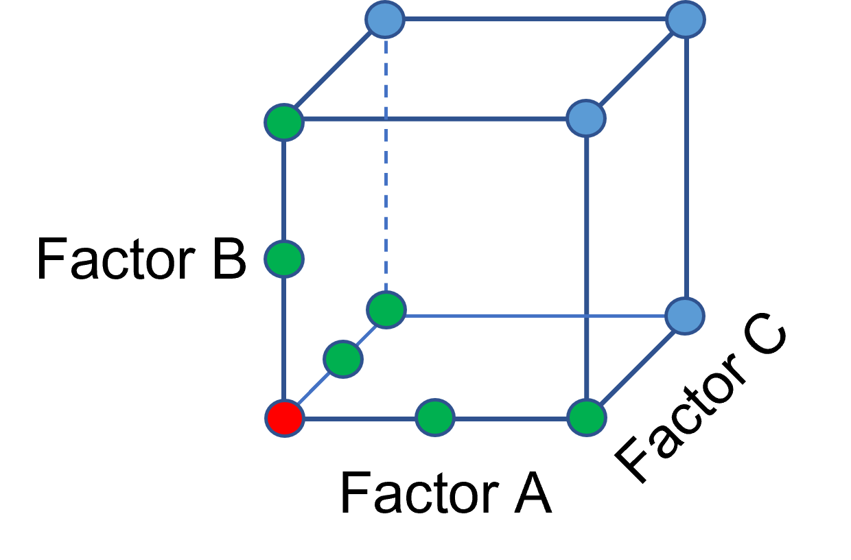
Figure 2: Fill out to factorial region
In other cases, OFAT studies may be done by taking a standard process condition as a starting point and then testing factors at new levels both lower and higher than the standard condition (see Figure 3). This data can estimate linear and nonlinear effects of changing each factor individually. Again, it cannot estimate any interactions between the factors. This means that if the process optimum is anywhere other than exactly on the lines, it cannot be predicted. Data that more fully covers the design space is required.
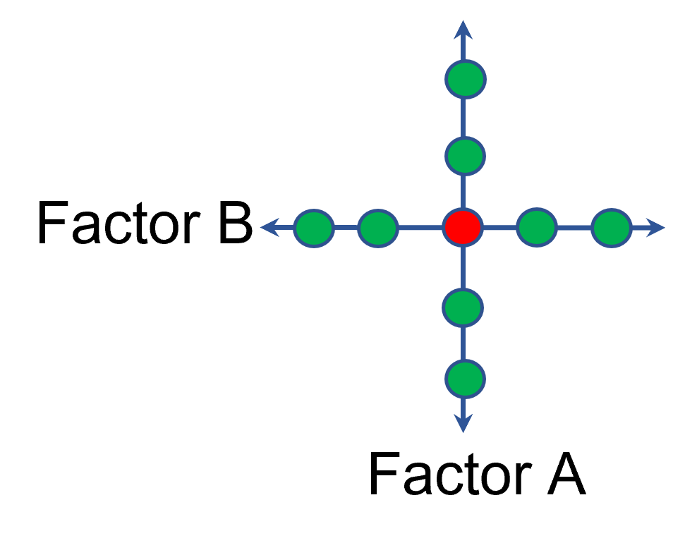
Figure 3: OFAT
A face-centered central composite design (CCD)—a response surface method (RSM)—has factorial (corner) points that define the region of interest (see Figure 4 – added blue dots). These points are used to estimate the linear and the interaction effects for the factors. The center point and mid points of the edges are used to estimate nonlinear (squared) terms.
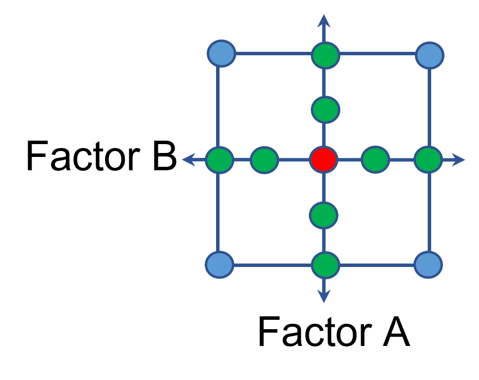
Figure 4: Face-Centered CCD
If an experimenter has completed the OFAT portion of the design, they can augment the existing data by adding the corner points and then analyzing as a full response surface design. This set of data can now estimate up to the full quadratic polynomial. There will likely be extra points from the original OFAT runs, which although not needed for model estimation, do help reduce the standard error of the predictions.
Running a statistically designed experiment from the start will reduce the overall experimental resources. But it is good to recognize that existing data can be augmented to gain valuable insights!
Learn more about design augmentation at the January webinar: The Art of Augmentation – Adding Runs to Existing Designs.
R-Squared Mysteries Solved
Design of experiments (DOE) and the resulting data analysis yields a prediction equation plus a variety of summary statistics. A set of R-squared values are commonly used to determine the goodness of model fit. In this blog, I peel back the raw versus adjusted versus predicted R-squared and explain how each can be interpreted, along with the relationships between them. The calculations of these values can be easily found online, so I won’t spend time on that, focusing instead on practical interpretations and tips.
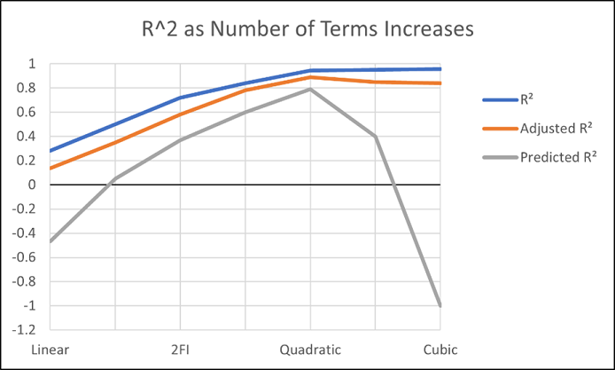
Raw R-squared measures the fraction of variation explained by the fitted predictive model. This is a good statistic for comparing models that all have the same number of terms (like comparing models consisting of A+B versus A+C). The downfall of this statistic is that it can be artificially increased simply by adding more terms to the model, even ones that are not statistically significant. For example, notice in Table 1 from an optimization experiment how R-squared increases as the model steps up in order from linear to two-factor interaction (2FI), quadratic and, finally, cubic (disregarding it being aliased).
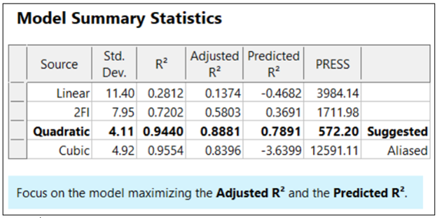
The “adjusted” R-squared statistic corrects this ‘inflation’ by penalizing terms that do not add statistical value. Thus, the adjusted R-squared statistic generally levels off (at 0.8881 in this case) and then begins to decrease at some point as seen in Table 1 for the cubic model (0.8396). The adjusted R-squared value cannot be inflated by including too many model terms. Therefore, you should report this measure of model fit, not the raw R-squared.
The “predicted” R-squared is most rigorous for assessing model fit, so much so that it often starts off negative at the linear order, as it does for the example in Table 1 (-0.4682). As you can see, this statistic improves greatly as significant terms are added to the model, and quickly decreases once non-significant terms are added, e.g., going negative again at cubic. If predicted R-squared goes negative, the model becomes worse than nothing, that is, simply taking the average of the data (a “mean” model)—that is not good!
Figures 1 illustrates how the predicted R-squared peaks at the quadratic model for the example. Once a model emerges at the highest adjusted and/or predicted R-squared, consider taking out any insignificant terms—best done with the aid of a computerized reduction algorithm. This often produces a big increase in the predicted R-squared.
Conclusion
The goal of modeling data is to correctly identify the terms that explain the relationship between the factors and the response. Use the adjusted R-squared and predicted R-squared values to evaluate how well the model is working, not the raw R-squared.
PS: You’ve likely been reading this expecting to find recommended adjusted and predicted R-squared values. I will not be providing this. Higher values indicate that more variation in the data or in predictions is explained by the model. How you use the model dictates the threshold that is acceptable to you. If the DOE goal is screening, low values can be acceptable. Remember that low R-squared values do not invalidate significant p-values. In other words, if you discover factors that have strong effects on the response, that is positive information, even if the model doesn’t predict well. A low predicted R-squared means that there is more unexplained variation in the system, and you have more work to do!
Why it pays to be skeptical of three-factor-interaction effects
Quite often, when providing statistical help for Stat-Ease software users, our consulting team sees an over-selection of effects from two-level factorial experiments. Generally, the line gets crossed when picking three-factor interactions (3FI), as I documented in the lead article for the June 2007 Stat-Teaser. In this case, the experimenter picked all the estimable effects when only one main effect (factor B) really stood out on the Pareto plot. Check it out!
In my experience, the true 3FIs emerge only when one of the variables is categorical with a very strong contrast. For example, early in my career as an R&D chemical engineer with General Mills, I developed a continuous process for hydrogenating a vegetable oil. By cranking up the pressure and temperature and using an expensive, noble-metal catalyst (palladium on a fixed bed of carbon), this new approach increased the throughput tremendously over the old batch process, which deployed powered nickel to facilitate the reaction. When setting up my factorial experiment, our engineering team knew better than to make the type of reactor one of the inputs, because being so different, this would generate many complications of time-temperature interactions differing from on process to the other. In cases like this, you are far better off doing separate optimizations and then seeing which process wins out in the end. (Unfortunately for me, I lost this battle due to the color bodies in the oil poisoning my costly catalyst.)
A response must really behave radically to require a 3FI for modeling as illustrated hypothetically in Figures 1 versus 2 for two factors—catalyst level (B) and temperature (D)—as a function of a third variable (E)—the atmosphere in the reactor.
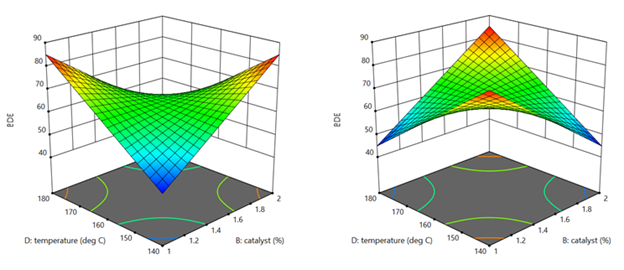
Figures 1 & 2: 3FI (BDE) surface with atmosphere of nitrogen vs air (Factor E at low & high levels)
These surfaces ‘flip-flop’ completely like a bird in flight. Although factor E being categorical does lead to a strong possibility of complex behavior from this experiment, the dramatic shift caused by it changing from one level to the other would be highly unusual by my reckoning.
It turns out that there is a middle ground with factorial models that obviates the need for third-order terms: Multiple two-factor interactions (2FIs) that share common factors. The actual predictive model, derived from a case study we present in our Modern DOE for Process Optimization workshop, is:
Yield = 63.38 + 9.88*B + 5.25*D − 3.00*E + 6.75*BD − 5.38*DE
Notice that this equation features two 2FIs, BD and DE, that share a common factor (D). This causes the dynamic behavior shown in Figures 3 and 4 without the need for 3FI terms.
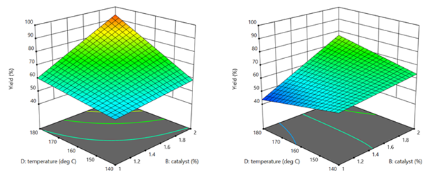
Figure 3 & 4: 2FI surface (BD) for atmosphere of nitrogen vs air (Factor E at low & high levels)
This simpler model sufficed to see that it would be best to blanket the batch reactor with nitrogen, that is, do not leave the hatch open to the air—a happy ending.
Conclusion
If it seems from graphical or other methods of effect selection that 3FI(s) should be included in your factorial model, be on guard for:
- Over-selection of effects (my first case)
- The need for a transformation (such as log): Be sure to check the Box-Cox plot (always!).
- Outlier(s) in your response (look over the diagnostic plots, especially the residual versus run).
- A combination of these and other issues—ask stathelp@statease.com for guidance if you use Stat-Ease software (send in the file, please).
I never say “never”, so if you really do find a 3FI, get back to me directly.
-Mark (mark@statease.com)
Avoiding Over-Selection of Effects on the Half-Normal Plot
One of the greatest tools developed by Cuthbert Daniel (1976), was the use of the half-normal plot to visually select effects for two-level factorials. Since these designs generally contain no replicates, there is no pure error to use as the base for statistical F-tests. The half-normal plot allows us to visually distinguish between the effects that are small (and normally distributed) versus large (and likely to be statistically significant). The subsequent ANOVA is built on this decision to split the effects into the few that are likely “signal” versus the majority that are likely “noise”.
Often the split between the groups is obvious, with a clear gap between them (see Figure 1), but sometimes it is more ambiguous and harder to decide where to “draw the line” (see Figure 2).
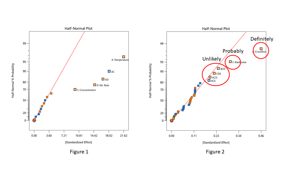
Stat-Ease consultants recommend staying conservative when deciding which effects to designate as the “signal”, and to be cautious about over-selecting effects. In Figure 2, the A effect is clearly different from the other effects and should definitely be selected. The C effect is also separated from the other effects by a “gap” and is probably different, so it should also be included in the potential model terms. The next grouping consists of four three-factor interactions (3FI’s.) Extreme caution should be exercised here – 3FI terms are very rare in most production and research settings. Also, they fall “on the line”, which indicates that they are most likely within the normal probability curve that contains the insignificant effects. These terms should be pooled together to estimate the error of the system. The conservative approach says that choosing A and C for the model is best. Adding any other terms is most likely just chasing noise.
Hints for choosing effects:
- Split the effects into two groups, distinguishing between the “big” and “small” ones, right versus left, respectively
- Start from the right side of the graph – that is where the biggest effects are
- Look for gaps that separate big effects from the rest of the group
- STOP if you select a 3FI term – these are very unlikely to be real effects (throw them back into the error pool)
- Don’t skip a term – if a smaller effect looks like it could be significant, then all larger effects also must be included
- Effects need to “jump off” the line – otherwise they are just part of the normal distribution
Sometimes you have to simply accept that the changes in the factor levels did not trigger a change in the response that was larger than the normal process variation (Figure 3). Note in Figure 3 that the far right points are straddling the straight line. These terms have virtually the same size effect – don’t select the lower one just because it is below the line.
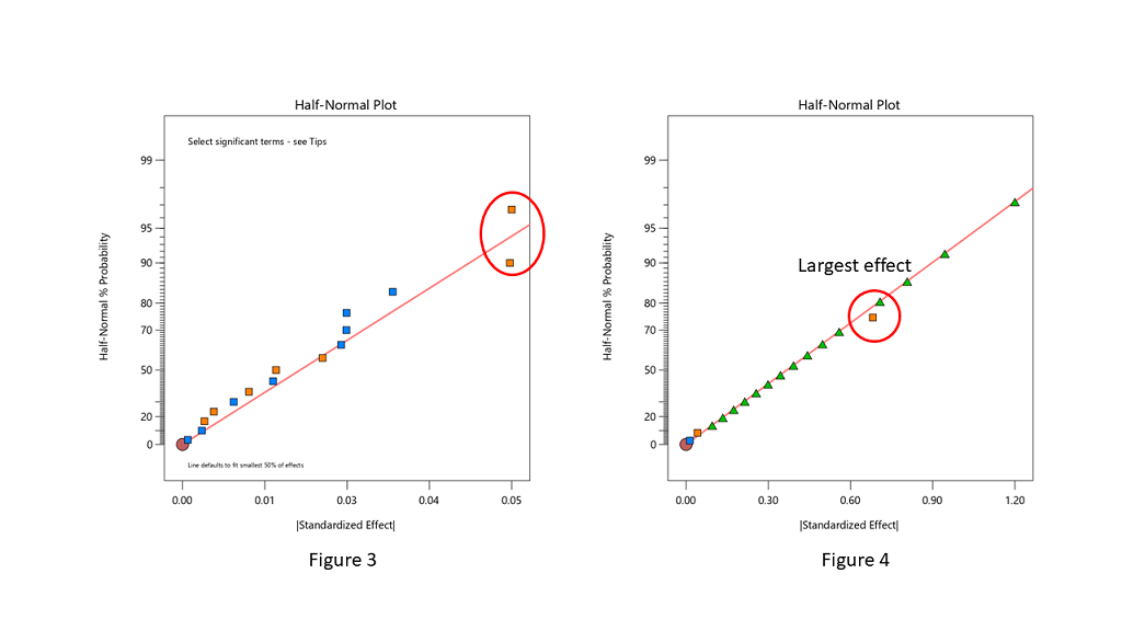
When you are lucky enough to have replicates, the pure error is then used to help position green triangles on the half-normal plot. The triangles span the amount of error in the system. If they go out farther than the biggest effect, that is a clear indication that there are no effects that are larger than the normal process variation. No effects are significant in this case (see Figure 4).
Conclusion
The half-normal plot of effects gives us a visual tool to split our effects into two groups. However, the use of the tool is a bit of an art, rather than an exact science. Combine this visual tool with both the ANOVA p-values and, most importantly, your own subject matter knowledge, to determine which effects you want to put into the final prediction model.
Cutting-Edge Tools in Design-Expert Version 13
Version 13 of Design-Expert® software (DX13) provides a substantial step up on ease of use and statistical power for design of experiments (DOE). As detailed below, it lays out an array of valuable upgrades for experimenters and industrial statisticians. See DX13’s amazing features for yourself via our free, fully functional, trial download at www.statease.com/trial/.
Modify Design Space Wizard

Quite often an experiment leads to promising results that lie just beyond its boundaries. DX13 paves the way via its new wizard for modifying your design space. Press the Augment Design button, select “Modify design space” and off you go. Run through the “Modify Design Space – Reactive Extrusion” tutorial, available via program Help, to see how wonderfully this new wizard works. As diagrammed on its initial screen, the modify-design-space tool facilitates shrinking and moving your space, not just expanding it. And it works on mixture as well as process space.
Poisson regression

For assessing measures that come by counts, Poisson regression models fit with greater precision than ordinary methods. Demonstrate this via the “Poisson Regression – Antiseptic” tutorial where Poisson regression proves to be just the right tool for modeling colony forming units (CFU) in a cell culture. This new modeling tool, along with logistic regression for binary responses (introduced in version 12), puts Design-Expert at a very high level for a DOE-dedicated program.
Multiple analyses per individual response

Easily model any response in various ways to readily compare them. Then chose the model most fitting for achieving optimization goals. Simply press the plus [+] button on the Analysis branch. The Antiseptic tutorial demonstrates the utility of trying several modeling alternatives, none of which can do better than Poisson regression (but worth a try!).
Rounding factor or component settings
Optimal (custom) designs work wonderfully well for laying out statistically ideal experiments. However, the numerical levels they produce often extend to an inconvenient number of decimal places. No worries: DX13 provides a new “Round Columns” button—very convenient for central composite and optimal designs. As demonstrated in the Antiseptic tutorial, this works especially well for mixture components—maintaining their proper total while making the recipe far easier for the experimenter to accomplish. Do so either on the basis of significant digits (as shown) or by decimal places.
Import Data
DX13 makes it far easier to bring in existing data. Simply paste in your data from a spreadsheet (or another statistical program) and identify each column as an input or output. If you paste in headers, right click rows to identify names and units of measure. For example, DX13 enables entry of the well-known Longley data (see the “Historical Data – Unemployment” tutorial for background) directly from an Excel spreadsheet. Easy! Once in Design-Expert, its advanced tools for design evaluation, modeling and graphics can be put to good use.
More Enhancements
Design
- The Constraints node now allows you to modify existing limits: Second thoughts? No problem!
- New ribbon with easy access to versatile design-layout features such as Change View, and Hide/Show Columns
- Runs outside the constraints flagged, but still usable for analysis; furthermore, they can be moved back into the valid space via the right-click menu
- Adding verification runs after an analysis no longer invalidates it
- Continuous and discrete numeric factors now indicated in the Design Summary
Analysis
- Response name now included when copying equations to Excel
- Pearson, Deviance, and Hosmer-Lemeshow goodness-of-it tests added for logistic regression
Diagnostics
- New preference for the default layout of the Diagnostics tabs
Graphs
- Box (and whiskers) Plot for Graph Columns: Another very useful tool for data exploration prior to analysis.
- Control multiple graphs at the same time with the factors tool: Side-by-side interactive views—enlightening!
- Perturbation and trace plots now colored by factor
- New All-Factor graphs option shows only factors selected for the model
- When the number of tick-marks becomes large, only a subset is shown
- For large designs, the Leverage graph scales to maximum value, rather than 1
- When FDS-graph crosshair goes above 80% it changes to black, rather than red