Stat-Ease Blog

Categories
Wrap-Up: Thanks for a great 2022 Online DOE Summit!
Thank you to our presenters and all the attendees who showed up to our 2022 Online DOE Summit! We're proud to host this annual, premier DOE conference to help connect practitioners of design of experiments and spread best practices & tips throughout the global research community. Nearly 300 scientists from around the world were able to make it to the live sessions, and many more will be able to view the recordings on the Stat-Ease YouTube channel in the coming months.
Due to a scheduling conflict, we had to move Martin Bezener's talk on "The Latest and Greatest in Design-Expert and Stat-Ease 360." This presentation will provide a briefing on the major innovations now available with our advanced software product, Stat-Ease 360, and a bit of what's in store for the future. Attend the whole talk to be entered into a drawing for a free copy of the book DOE Simplified: Practical Tools for Effective Experimentation, 3rd Edition. New date and time: Wednesday, October 12, 2022 at 10 am US Central time.
Even if you registered for the Summit already, you'll need to register for the new time on October 12. Click this link to head to the registration page. If you are not able to attend the live session, go to the Stat-Ease YouTube channel for the recording.

Want to be notified about our upcoming live webinars throughout the year, or about other educational opportunities? Think you'll be ready to speak on your own DOE experiences next year? Sign up for our mailing list! We send emails every month to let you know what's happening at Stat-Ease. If you just want the highlights, sign up for the DOE FAQ Alert to receive a newsletter from Engineering Consultant Mark Anderson every other month.
Thank you again for helping to make the 2022 Online DOE Summit a huge success, and we'll see you again in 2023!
Randomization Done Right
Randomization is essential for success with planned experimentation (DOE) to protect factor effects against bias by lurking variables. For example, consider the 8-run, two-level factorial design shown in Table 1. It lays out the low (−) and high (+) coded levels of each factor in standard, not random, order. Notice that factor C changes level only once throughout the experiment—first being set at the low (minus) level for four runs, followed by the remaining four runs set at the high (plus) level. Now, let’s say that the humidity in the room increases throughout the day—affecting the measured response. Since the DOE runs are not randomized, the change in humidity biases the calculated effect of the non-randomized factor C. Therefore, the effect of factor C includes the humidity change – it is no longer purely due to the change from low to high. This will cause analysis problems!
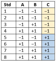
Table 1: Standard order of 8-run design
Randomization itself presents some problems. For example, one possible random order is the classic standard layout, which, as you now know, does not protect against time-related effects. If this unlikely pattern, or other non-desirable patterns are seen, then you should re-randomize the runs to reduce the possibility of bias from lurking variables.
Randomizing center points or other replicates
Replicates, such as center points, are used to collect information on the pure error of the system. To optimize the validity of this information, center points should be spaced out over the experimental run order. Random order may inadvertently place replicates in sequential order. This requires manual intervention by the researcher to break up or separate the repeated runs so that each run is completed independently of the matching run.
In both Design-Expert® software and Stat-Ease 360 you can re-randomize by right-clicking on the Run column header and selecting Randomize, as shown in Figure 1. You can also simply edit the Run order and swap two runs by changing the run numbers manually. This is often the easiest method when you want to separate center points, for example.
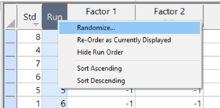
Figure 1: Right-click to Randomize
When Randomization Doesn’t Work
While randomization is ideal statistically, sometimes it is cumbersome in practice. For instance, temperature can take a very long time to change, so completely randomizing the runs may cause the experiment to go way beyond the time budget. In this case, researchers look for ways to reduce the complete randomization of the design.
I want to highlight a common DOE mistake. An incorrect way to restrict the randomization is to use blocks. Blocking is a statistical technique that groups the experimental runs to eliminate a potential source of variation from the data analysis. A common blocking factor is “day”, setting the block groups to eliminate day-to-day variation. Although this is a form of restricting randomization, if you block on an experimental factor like temperature, then statistically the block (temperature) effect will be removed from the analysis. Any interaction effect with that block will also be removed. The removal of this key effect very likely destroys the entire analysis! Blocking is not a useful method for restricting the randomization of a factor that is being studied in the experiment. For more information on why you would block, see “Blocking: Mowing the Grass in Your Experimental Backyard”.
If factor changes need to be restricted (not fully randomized), then building a split-plot design is the best way to go. A split-plot design takes into account the hard-to-change versus easy-to-change factors in a restricted randomization test plan. Perfect! The associated analysis properly assesses the differences in variation between these two groups of factors and provides the correct effect evaluation. The statistical analysis is a bit more complex, but good DOE software will handle it easily. Split-plot designs are a more complex topic, but commonly used in today’s experimental practices. Learn more about split-plot designs in this YouTube video: Split Plot Pros and Cons – Dealing with a Hard-to-Change Factor.
Wrapping up
Randomization is essential for valid and unbiased factor effect calculations, which is central to effective design of experiments analysis. It is up to the experimenter to ensure that the randomization of the experimental runs meets the DOE goals. Manual intervention may be required to separate any replicated points, such as center points. If complete randomization is not possible from a practical standpoint, build a split-plot design that statistically accounts for those restrictions.
Blocking: Mowing the Grass in Your Experimental Backyard
One challenge of running experiments is controlling the variation from process, sampling and measurement. Blocking is a statistical tool used to remove the variation coming from uncontrolled variables that are not part of the experiment. When the noise is reduced, the primary factor effects are estimated more easily, which allows the system to be modeled more precisely.
For example, an experiment may contain too many runs to be completed in just one day. However, the process may not operate identically from one day to the next, causing an unknown amount of variation to be added to the experimental data. By blocking on the days, the day-to-day variation is removed from the data before the factor effects are calculated. Other typical blocking variables are raw material batches (lots), multiple “identical” machines or test equipment, people doing the testing, etc. In each case the blocking variable is simply a resource required to run the experiment-- not a factor of interest.
Blocking is the process of statistically splitting the runs into smaller groups. The researcher might assume that arranging runs into groups randomly is ideal - we all learn that random order is best! However, this is not true when the goal is to statistically assess the variation between groups of runs, and then calculate clean factor effects. Design-Expert® software splits the runs into groups using statistical properties such as orthogonality and aliasing. For example, a two-level factorial design will be split into blocks using the same optimal technique used for creating fractional factorials. The design is broken into parts by using the coded pattern of the high-order interactions. If there are 5 factors, the ABCDE term can be used. All the runs with “-” levels of ABCDE are put in the first block, and the runs with “+“ levels of ABCDE are put in the second block. Similarly, response surface designs are also blocked statistically so that the factor effects can be estimated as cleanly as possible.
Blocks are not “free”. One degree of freedom (df) is used for each additional block. If there are no replicates in the design, such as a standard factorial design, then a model term may be sacrificed to filter out block-by-block variation. Usually these are high-order interactions, making the “cost” minimal.
After the experiment is completed, the data analysis begins. The first line in the analysis of variance (ANOVA) will be a Block sum of squares. This is the amount of variation in the data that is due to the block-to-block differences. This noise is removed from the total sum of squares before any other effects are calculated. Note: Since blocking is a restriction on the randomization of the runs, this violates one of the ANOVA assumptions (independent residuals) and no F-test for statistical significance is done. Once the block variation is removed, the model terms can be tested against a smaller residual error. This allows factor effects to stand out more, strengthening their statistical significance.
Example showing the advantage of blocking:
In this example, a 16-blend mixture experiment aimed at fitting a special-cubic model is completed over 2 days. The formulators expect appreciable day-to-day variation. Therefore, they build a 16-run blocked design (8-runs per day). Here is the ANOVA:
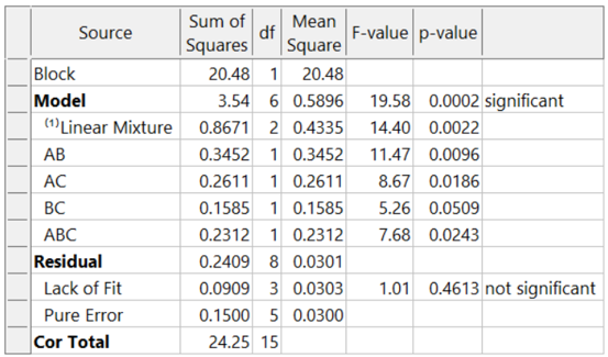
The adjusted R² = 0.8884 and the predicted R² = 0.7425. Due to the blocking, the day-to-day variation (sum of squares of 20.48) is removed. This increases the sensitivity of the remaining tests, resulting in an outstanding predictive model!
What if these formulators had not thought of blocking and, instead, simply, run the experiment in a completely randomized order over two days? The ANOVA (again for the designed-for special-cubic mixture model) now looks like this:
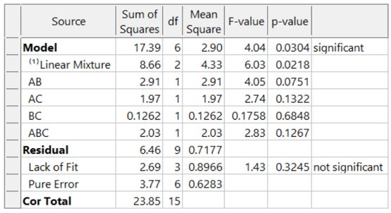
The model is greatly degraded, with adjusted R² = 0.5487, and predicted R² = 0.0819 and includes many insignificant terms. While the blocked model shown above explains 74% of the variation in predictions (the predicted R-Square), the unblocked model explains only 8% of the variation in predictions, leaving 92% unexplained. Due to the randomization of the runs, the day-to-day variation pollutes all the effects, thus reducing the prediction ability of the model.
Conclusion:
Blocks are like an insurance policy – they cost a little, and often aren’t required. However, when they are needed (block differences large) they can be immensely helpful for sorting out the real effects and making better predictions. Now that you know about blocking, consider whether it is needed to make the most of your next experiment.
Blocking FAQs:
How many runs should be in a block?
My rule-of-thumb is that a block should have at least 4 runs. If the block size is smaller, then don’t use blocking. In that case, the variable is simply another source of variation in the process.
Can I block a design after I’ve run it?
You cannot statistically add blocks to a design after it is completed. This must be planned into the design at the building stage. However, Design-Expert has sophisticated analysis tools and can analyze a block effect even if it was not done perfectly (added to the design after running the experiment). In this case, use Design Evaluation to check the aliasing with the blocks, watching for main effects or two-factor interactions (2FI).
Are there any assumptions being made about the blocks?
There is an assumption that the difference between the blocks is a simple linear shift in the data, and that this variable does not interact with any other variable.
I want to restrict the randomization of my factor because it is hard to change the setting with every run. Can I use blocking to do this?
No! Only block on variables that you are not studying. If you need to restrict the randomization of a factor, consider using a split-plot design.
Understanding Lack of Fit: When to Worry
An analysis of variance (ANOVA) is often accompanied by a model-validation statistic called a lack of fit (LOF) test. A statistically significant LOF test often worries experimenters because it indicates that the model does not fit the data well. This article will provide experimenters a better understanding of this statistic and what could cause it to be significant.
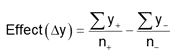
The LOF formula is:
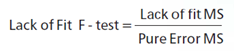
where MS = Mean Square. The numerator (“Lack of fit”) in this equation is the variation between the actual measurements and the values predicted by the model. The denominator (“Pure Error”) is the variation among any replicates. The variation between the replicates should be an estimate of the normal process variation of the system. Significant lack of fit means that the variation of the design points about their predicted values is much larger than the variation of the replicates about their mean values. Either the model doesn't predict well, or the runs replicate so well that their variance is small, or some combination of the two.
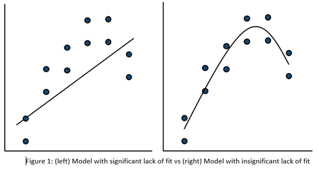
Case 1: The model doesn’t predict well
On the left side of Figure 1, a linear model is fit to the given set of points. Since the variation between the actual data and the fitted model is very large, this is likely going to result in a significant LOF test. The linear model is not a good fit to this set of data. On the right side, a quadratic model is now fit to the points and is likely to result in a non-significant LOF test. One potential solution to a significant lack of fit test is to fit a higher-order model.
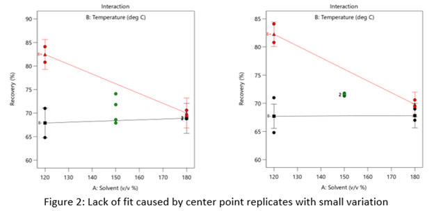
Case 2: The replicates have unusually low variability
Figure 2 (left) is an illustration of a data set that had a statistically significant factorial model, including some center points with variation that is similar to the variation between other design points and their predictions. Figure 2 (right) is the same data set with the center points having extremely small variation. They are so close together that they overlap. Although the predicted factorial model fits the model points well (providing the significant model fit), the differences between the actual data points are substantially greater than the differences between the center points. This is what triggers the significant LOF statistic. The center points are fitting better than the model points. Does this significant LOF require us to declare the model unusable? That remains to be seen as discussed below.
When there is significant lack of fit, check how the replicates were run— were they independent process conditions run from scratch, or were they simply replicated measurements on a single setup of that condition? Replicates that come from independent setups of the process are likely to contain more of the natural process variation. Look at the response measurements from the replicates and ask yourself if this amount of variation is similar to what you would normally expect from the process. If the “replicates" were run more like repeated measurements, it is likely that the pure error has been underestimated (making the LOF denominator artificially small). In this case, the lack of fit statistic is no longer a valid test and decisions about using the model will have to be made based on other statistical criteria.
If the replicates have been run correctly, then the significant LOF indicates that perhaps the model is not fitting all the design points well. Consider transformations (check the Box Cox diagnostic plot). Check for outliers. It may be that a higher-order model would fit the data better. In that case, the design probably needs to be augmented with more runs to estimate the additional terms.
If nothing can be done to improve the fit of the model, it may be necessary to use the model as is and then rely on confirmation runs to validate the experimental results. In this case, be alert to the possibility that the model may not be a very good predictor of the process in specific areas of the design space.
What’s Behind Aliasing in Fractional-Factorial Designs
Aliasing in a fractional-factorial design means that it is not possible to estimate all effects because the experimental matrix has fewer unique combinations than a full-factorial design. The alias structure defines how effects are combined. When the researcher understands the basics of aliasing, they can better select a design that meets their experimental objectives.
Starting with a layman’s definition of an alias, it is 2 or more names for one thing. Referring to a person, it could be “Fred, also known as (aliased) George”. There is only one person, but they go by two names. As will be shown shortly, in a fractional-factorial design there will be one calculated effect estimate that is assigned multiple names (aliases).
This example (Figure 1) is a 2^3, 8-run factorial design. These 8 runs can be used to estimate all possible factor effects including the main effects A, B, C, followed by the interaction effects AB, AB, BC and ABC. An additional column “I” is the Identity column, representing the intercept for the polynomial.
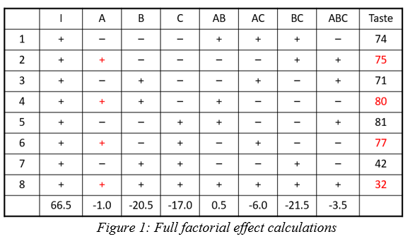
Each column in the full factorial design is a unique set of pluses and minuses, resulting in independent estimates of the factor effects. An effect is calculated by averaging the response values where the factor is set high (+) and subtracting the average response from the rows where the term is set low (-). Mathematically this is written as follows:
In this example the A effect is calculated like this:
The last row in figure 1 shows the calculation result for the other main effects, 2-factor and 3-factor interactions and the Identity column.
In a half-fraction design (Figure 2), only half of the runs are completed. According to standard practice, we eliminate all the runs where the ABC column has a negative sign. Now the columns are not unique – pairs of columns have the identical pattern of pluses and minuses. The effect estimates are confounded (aliased) because they are changing in exactly the same pattern. The A column is the same pattern as the BC column (A=BC). Likewise, B=AC and C=AB. Finally, I=ABC. These paired columns are said to be “aliased” with each other.
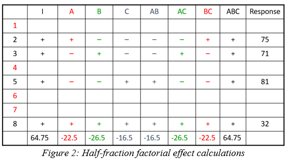
In the half-fraction, the effect of A (and likewise BC) is calculated like this:
When the effect calculations are done on the half-fraction, one mathematical calculation represents each pair of terms. They are no longer unique. Software may label the pair only by the first term name, but the effect is really all the real effects combined. The alias structure is written as:
I = ABC
[A] = A+BC
[B] = B+AC
[C] = C+AB
Looking back at the original data, the A effect was -1 and the BC effect was -21.5. When the design is cut in half and the aliasing formed, the new combined effect is:
A+BC = -1 + (-21.5) = -22.5
The aliased effect is the linear combination of the real effects in the system. Aliasing of main effects with two-factor interactions (2FI) is problematic because 2FI’s are fairly likely to be significant in today’s complex systems. If a 2FI is physically present in the system under study, it will bias the main effect calculation. Any system that involves temperature, for instance, is extremely likely to have interactions of other factors with temperature. Therefore, it would be critical to use a design table that has the main effect calculations separated (not aliased) from the 2FI calculations.
What type of fractional-factorial designs are “safe” to use? It depends on the purpose of the experiment. Screening designs are generally run to correctly identify significant main effects. In order to make sure that those main effects are correct (not biased by hidden 2FI’s), the aliasing of the main effects must be with three-factor interactions (3FI) or greater. The alias structure looks something like this (only main effect aliasing shown):
I = ABCD
[A] = A+BCD
[B] = B+ACD
[C] = C+ABD
[D] = D+ABC
If the experimental goal is characterization or optimization, then the aliasing pattern should ensure that both main effects and 2FI’s can be estimated well. These terms should not be aliased with other 2FI’s.
Within Design-Expert or Stat-Ease 360 software, color-coding on the factorial design selection screen provides a visual signal. Here is a guide to the colors, listed from most information to least information:
- White squares – full factorial designs (no aliasing)
- Green squares – good estimates of both main effects and 2FI’s
- Yellow squares – good estimates of main effects, unbiased from 2FI’s in the system
- Red squares – all main effects are biased by any existing 2FI’s (not a good design to properly identify effects, but acceptable to use for process validation where it is assumed there are no effects).
This article was created to provide a brief introduction to the concept of aliasing. To learn more about this topic and how to take advantage of the efficiencies of fractional-factorial designs, enroll in the free eLearning course: How to Save Runs with Fractional-Factorial Designs.
Good luck with your DOE data analysis!