This tutorial, the first of three in this series, shows how to use
Stat-Ease® software for response surface methodology (RSM). This class of
designs is aimed at process optimization. A case study provides a real-life feel
to the exercise.
If you are in a rush to get the gist of design and analysis of RSM, hop past all
the “Note” sections. However, if/when you find the time, it will be well worth
the effort to explore these “by-the-ways.”
Note
Due to the specific nature of this case study, a number of features
that could be helpful to you for RSM will not be implemented in this
tutorial. Many of these features are used in the earlier tutorials. If you
have not completed all these tutorials, consider doing so before starting
this one.
We will presume that you are knowledgeable about the statistical aspects of RSM.
For a good primer on the subject, see RSM Simplified, 2ndEdition (Anderson and
Whitcomb, Productivity, Inc., New York, 2016). To gain a working knowledge
of RSM, we recommend you attend our Modern DOE for Process Optimization
workshop. Visit www.statease.com and follow the “Learn DOE” link for more details
on this and other educational resources from Stat-Ease.
The case study in this tutorial involves production of a chemical. The two most
important responses, designated by the letter “y”, are:
y1 - Conversion (% of reactants converted to product)
y2 - Activity.
The goals are to maximize Conversion – achieving at least 80% (ideally 100%) and hit an Activity target of 63,
allowing for a 60-66 range on this product attribute. In Part 2 of this three-part RSM tutorial you will learn
how to do numerical optimization that produces the most desirable combination of these or any other set of
multiple responses. But first things first – you must produce useful models for Conversion and Activity. Continue
on to see how.
The experimenter chose three process factors to study. Their names and levels
are shown in the following table.
Factor
Units
Low Level (-1)
High Level (+1)
A - Time
minutes
40
50
B - Temperature
degrees C
80
90
C - Catalyst
percent
2
3
Factors for response surface study
You will study the chemical process using a standard RSM design called a central
composite design (CCD). It’s well suited for fitting a quadratic surface, which
usually works nicely for process optimization.
Note
The three-factor layout for this CCD
is pictured below. It is composed of a core factorial that forms a cube with
sides that are two coded units in length (from -1 to +1 as noted in the table
above). The stars represent axial points. How far out from the cube these
should go is a matter for much discussion between statisticians. They
designate this distance “alpha” – measured in terms of coded factor levels. As
you will see, the program offers a variety of options for alpha.
Start the program and click the blank-sheet icon on the left of the
toolbar and then click Response Surface from the list of designs on the left
to show the designs available for RSM.
The default selection is the Central Composite design, which is used in this
case study.
Note
To see alternative RSM designs, click at the far
left on Box Behnken (notice 17 runs near the screen bottom for the 3-factor minimum) and
the 3-Level Factorial option (32 runs, including 5 center points). Other options are Optimal (Custom)—the
most flexible way to build an RSM design—it being computer generated; and the Definitive Screen (DSD),
which, as we note in the description, may not be the best choice due to issues estimating second-order
effects—specifically the two-factor interactions. Now go back and re-select Central Composite design—a
tried and true template for RSM optimization that can accommodate as few as two factors.
Central Composite design.
If not already entered, click the up arrow in the Numeric Factors entry box
and Select 3 as shown below.
Before entering factors and ranges, click Options. Notice that it
defaults to a Rotatable design with the axial (star) points set at
1.68179 coded units from the center – a conventional choice for the CCD.
Default CCD option for alpha set so design is rotatable
Many options are statistical in nature, but one that produces less extreme
factor ranges is the “Practical” value for alpha. This is computed by taking
the fourth root of the number of factors (in this case 3¼ or 1.31607).
See RSM Simplified Chapter 8 “Everything You Should Know About CCDs (but dare
not ask!)” for details on this practical versus other levels suggested for alpha
in CCDs – the most popular of which may be the “Face Centered” (alpha equals
one). Press OK to accept the rotatable value.
Using the information provided in the table on page 1 of this tutorial (or on
the screen capture below), type in the details for factor Name (A, B, C),
Units, and Low and High levels.
You’ve now specified the cubical portion of the CCD. As you did this,
the program calculated the coded distance “alpha” for placement on the star
points in the central composite design.
Note
Alternatively, by clicking the “entered factor ranges in terms of
alphas” option you can control how far out the runs will go for each of your
factors.
Now return to the bottom of the central composite design form. Leave Type at
its default value of Full (the other option is a “small” CCD, which we do not
recommend unless you must reduce the number of runs to the bare minimum).
You will need two blocks for this design, one for each day, so click the
Blocks field and select 2.
Notice the software displays how this CCD will be laid out in the two blocks –
for example, 4 center points will go in one and 2 in the other. Click
Next to reach the second page of the “wizard” for building a response
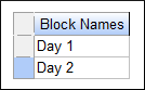
surface design. You now have the option of identifying Block Names. Enter
Day 1 and Day 2 as shown below.
At any time in the design-building phase, you can return to the previous page by
pressing the Back button. Then you can revise your selections. Press Finish
to view the design layout (your run order may differ due to randomization).
Note
The program offers many ways to modify the design and how it’s
laid out on-screen. Preceding tutorials, especially
Part 2 for One-Factor, delved into this in detail,
so go back and look this over if you haven’t already.
Design layout (your run order may differ due to randomization)
Now that you’ve invested some time into your design, it would be prudent to save
your work.
Enter the Response Data – Create Simple Scatter Plots
Assume that the experiment is now completed. At this stage, the responses must
be entered into the program. We see no benefit to making you type all the
numbers, particularly with the potential confusion due to differences in
randomized run orders. Therefore, use the Help, Tutorial Data menu and
select Chemical Conversion from the list.
Let’s examine the data! Click on the Design node on the left to view the
design spreadsheet. Move your cursor to Std column header and right-click
to bring up a menu from which to select Sort Ascending (this can also be
done via a double-click on the header).
Notice the new column identifying points as “Factorial,” “Center” (for center
point), and so on. Notice how the factorial points align only to the Day 1 block.
Then in Day 2 the axial points are run. Center points are divided between the
two blocks.
Unless you change the default setting for the Select option, do not expect the
Type column to appear the next time you run the program. It is only on
temporarily at this stage for your information.
Before focusing on modeling the response as a function of the factors varied in
this RSM experiment, it will be good to assess the impact of the blocking via a
simple scatter plot. Click the Custom Graphs node branching from the design
‘root’ at the upper left of your screen. You should see a scatter plot with
factor A:Time on the X-axis and the Conversion response on the Y-axis.
Note
The correlation grid that pops up with the Custom Graphs can be very
interesting. First off, observe that it exhibits red along the
diagonal—indicating the complete (r=1) correlation of any variable with
itself (Run vs Run, etc). Block versus run (or, conversely, run vs block) is
also highly correlated due to this restriction in randomization (runs having
to be done for day 1 before day 2). It is good to see so many white squares
because these indicate little or no correlation between factors, thus they
can be estimated independently.
For now, it is most useful to produce a plot showing the impact of blocks
because this will be literally blocked out in the analysis. Therefore, on the
Correlation Tool click the button where Conversion intersects with
Block as shown below. Then on the Custom Graphs Tool change Color By
to Space Type.
Scatterplot of Conversion by Block with points colored by Space Type
The graph a slight difference between the center points (the red points) for Block 1
versus Block 2. Bear in mind that this day-by-day difference will be blocked out
mathematically so as not to bias the estimation of factor effects.
On the Correlation grid, change the Block plot to Activity by clicking down the column one box to see
how this second response is affected by the day-to-day blocking (even less).
Viewing Block difference on second response—Activity
Next, to see how the responses correlate, click the square for Conversion.
Now that we have two numeric factors along the axes, we can see the correlation
between them. In the upper left of the legend, you will see the correlation is
slight - only 0.224.
You may also note there is a faded pink color in the box in the grid for this
graph, denoting the slight upward correlation.
Now for a really awesome scatterplot in 3D, on the Custom Graphs tool change
change the X Axis to A:Time, the Y1 Axis to Factor C:Catalyst and
the Z-Axis to Response R2:Activity. Then Color by: Space Type and
Size by: Response R1 Conversion. This provides a dramatic view of conditions
leading to maximizing Conversion at the 63 target for Activity. For example, if
you click the large green (Axial) circle (high conversion!), it’s identified as a
run that produced a 63.2 Activity—well within specification (60-66). Grab
the graph with your mouse and rotate it around for a better look.
3D scatterplot with points colored and sized by user preferences
Continue exploring relationships with the custom graph tools. However, do not
get carried away with this, because it will be much more productive to do
statistical analysis before drawing any conclusions.
Now let’s start analyzing the responses numerically. Under the Analysis
branch click the node labeled Conversion and press the Start Analysis
button. A new set of tabs appears at the top of your screen. They are
arranged from left to right in the order needed to complete the analysis.
What could be simpler?
Stat-Ease software provides a full array of response transformations on the
Configure tab. Click the icon for Topic Help. For now, accept the default
transformation selection of None by pressing Start Analysis.
Now click the Fit Summary tab. At this point the program fits linear,
two-factor interaction (2FI), quadratic, and cubic polynomials to the response.
At the top is the response identification, immediately followed below, in this
case, by a warning: “The Cubic Model is aliased.” Do not be alarmed. By design,
the central composite matrix provides too few unique design points to determine
all the terms in the cubic model. It’s set up only for the quadratic model (or
some subset).
Next you will see several extremely useful tables for model selection. Each
table is discussed briefly via sidebars in this tutorial on RSM.
The table of “Sequential Model Sum of Squares” shows how
terms of increasing complexity contribute to the total model.
Note
The Sequential Model Sum of Squares table: The model
hierarchy is described below:
“Linear vs Block”: the significance of adding the linear terms to the mean
and blocks,
“2FI vs Linear”: the significance of adding the two factor interaction terms
to the mean, block, and linear terms already in the model,
“Quadratic vs 2FI”: the significance of adding the quadratic (squared) terms
to the mean, block, linear, and twofactor interaction terms already in the
model,
“Cubic vs Quadratic”: the significance of the cubic terms beyond all other
terms.
For each source of terms (linear, etc.), examine the p-value to
see if it falls below 0.05 (or whatever statistical-significance level you
choose). So far, the program is indicating (via bold highlighting) the
quadratic model looks best – these terms are significant, but adding the cubic
order terms will not significantly improve the fit. (Even if they were
significant, the cubic terms would be aliased, so they wouldn’t be useful for
modeling purposes.) Move down to the Lack of Fit Tests pane for Lack of Fit
tests on the various model orders.
The “Lack of Fit Tests” pane compares residual error with “Pure Error” from
replicated design points. If there is significant lack of fit, as shown by a low
p-value, then be careful about using the model as a
response predictor. In this case, the linear model definitely can be ruled out,
because its p-value falls below 0.05. The quadratic model, identified earlier
as the likely model, does not show significant lack of fit. Remember that the
cubic model is aliased, so it should not be chosen.
Look over the last pane in the Fit Summary report, which provides “Model
Summary Statistics” for the ‘bottom line’ on comparing the options.The quadratic
model comes out best: It exhibits low standard deviation (“Std. Dev.”), high
“R-Squared” values, and a low “PRESS.”
Note
PRESS stands for predicted residual sum of squares. For details on
this model-fit statistic, search Help, Contents and view the details on
“Fit Summary: Model PRESS.” The Predicted R-Squared relates directly inverse
to PRESS. In other words, low PRESS creates high Predicted R-Squared. That’s
good! Once PRESS get above a certain level, Predicted R-Squared goes negative.
That’s not good.
The program automatically underlines at least one “Suggested” model. Always
confirm this suggestion by viewing these tables.
Note
From the main menu select Help, Screen Tips or simply press the
lightbulb icon () for more information about the procedure for
choosing model(s).
The program allows you to select a model for in-depth statistical study. Click
the Model tab at the top of the screen to see the terms in the model.
The program defaults to the “Suggested” model shown in the earlier Fit Summary
table.
Note
If you want, you can choose an alternative model from the Process
Order pull-down list. (Be sure to try this in the rare cases when
Stat-Ease software suggests more than one model.)
Also, you could now manually reduce the model by clicking off insignificant
effects. For example, you will see in a moment that several terms in this case
are marginally significant at best. The program provides several automatic
reduction algorithms as alternatives to the “Manual” method: “Backward,”
“Forward,” and “Stepwise.” Click the “Auto Select…” button to see these. For
more details, click the Help button at the bottom of the Automatic Model
Selection screen.
Click the ANOVA tab to produce the analysis of variance for the selected
model.
The ANOVA in this case confirms the adequacy of the quadratic model (the Model
p-value is less than 0.05.) You can also see probability values for each
individual term in the model. You may want to consider removing terms with
probability values greater than 0.10. Use process knowledge to guide your
decisions.
Next, move over to the Fit Statistics pane to see various statistics to
augment the ANOVA. The R-Squared statistics are very good — near to 1.
Next, move down to the Coefficients pane to bring the following details to your
screen, including the mean effect-shift for each block, that is; the difference
from Day 1 to Day 2 in the response.
Press Coded Equation to bring the next section to your screen — the
predictive models in terms of coded factors. Click Actual Equation for
the predictive models in terms of actual factors. Block terms are left out.
These terms can be used to re-create the results of this experiment, but they
cannot be used for modeling future responses.
You cannot edit any ANOVA outputs. However, you can copy and paste the data to
your favorite word processor or spreadsheet. As detailed in the
One-Factor RSM tutorial, the program provides a Copy Formula tool to export
equations directly to Excel in a handy format that allows you to enter whatever
inputs you like to generate predicted response. This is especially useful for providing
just the actual equation to colleagues or clients who do not need (or want) to know all the
other details—just what’s needed to ‘plug and chug’ for generating a prediction at any given
setup for the actual factor levels.
Note
To copy or export numerical outputs from Stat-Ease software, simply click the upper left
corner of the table to highlight all rows and columns and then right click anywhere over the
highlighted area to get a menu of options.
The diagnostic details provided by the program can best be grasped by viewing
plots available via the Diagnostics tab. The most important diagnostic —
normal probability plot of the residuals — appears in the first pane.
Data points should be approximately linear. A non-linear pattern (such as an
S-shaped curve) indicates non-normality in the error term, which may be corrected
by a transformation. The only sign of any problems in this data may be the point
at the far right. Click this on your screen to highlight it as shown above.
Note
Notice that residuals are “externally studentized” unless you change
their form on the drop-down menu at the top of your screen (not advised). This
provides two advantages:
Externally calculating residuals increases the sensitivity for detecting
outliers.
Studentized residuals counteract varying leverages due to design point
locations. For example, center points carry little weight in the fit and
thus exhibit low leverage.
Now you can see that, although the highlighted run does differ more from its
predicted value than any other, there is really no cause for alarm due to it
being within the red control limits.
Next move to the Cook’s Distance tab.
Cook’s Distance — the first of the Influence diagnostics
Nothing stands out here.
Move on to the Leverage tab. This is best explained by the previous tutorial
on One-Factor RSM so go back to that if you did not already go through it. Then
skip ahead to DFBETAS, which breaks down the changes in the model to each
coefficient, which statisticians symbolize with the Greek letter β, hence the
acronym DFBETAS — the difference in betas. For the Term click the
down-list arrow and select A as shown in the following screen shot.
You can evaluate ten model terms (including the intercept) for this quadratic
predictive model (see sidebar below for help).
Note
Reposition your mouse over the Term field and simply scroll your
mouse wheel to quickly move up and down the list. In a similar experiment to
this one, where the chemist changed catalyst, the DFBETAS plot for that factor
exhibited an outlier for the one run where its level went below a minimal level
needed to initiate the reaction. Thus, this diagnostic proved to be very helpful
in seeing where things went wrong in the experiment.
Now move on to the Report tab in the bottom-right pane to bring up detailed
case-by-case diagnostic statistics, many which have already been shown
graphically.
The footnote below the table (“Predicted values include block
corrections.”) alerts you that any shift from block 1 to block 2 will be
included for purposes of residual diagnostics. (Recall that block corrections
did not appear in the predictive equations shown in the ANOVA report.)
The residuals diagnosis reveals no statistical problems, so now let’s generate
response surface plots. Click the Model Graphs tab. The 2D contour plot of
factors A versus B comes up by default in graduated color shading.
The program displays any actual point included in the design space
shown. In this case you see a plot of conversion as a function of time and
temperature at a mid-level slice of catalyst. This slice includes six center
points as indicated by the dot at the middle of the contour plot. By
replicating center points, you get a very good power of prediction at the
middle of your experimental region.
The Factors Tool appears on the right with the default plot. Move
this around as needed by clicking and dragging the top blue border (drag it back
to the right side of the screen to “pin” it back in place. The tool controls
which factor(s) are plotted on the graph.
Note
Each factor listed in the Factors Tool has either
an axis label, indicating that it is currently shown on the graph, or a slider
bar, which allows you to choose specific settings for the factors that are not
currently plotted. All slider bars default to midpoint levels of those factors
not currently assigned to axes. You can change factor levels by dragging their
slider bars or by left-clicking factor names to make them active (they become
highlighted) and then typing desired levels into the numeric space near the
bottom of the tool. Give this a try.
Click the C: Catalyst toolbar to see its value. Don’t worry if the slider
bar shifts a bit — we will instruct you how to re-set it in a moment.
Factors tool showing factor C highlighted and value displayed
Left-Click the bar with your mouse and drag it to the right.
As indicated by the color key on the left, the surface becomes ‘hot’ at higher
response levels, yellow in the ’80’s, and red above 90 for Conversion.
Note
To enable a handy tool for reading coordinates off contour plots, go
to View, Show Crosshairs Window (click and drag the titlebar if you’d
like to unpin it from the left of your screen). Now move your mouse over the
contour plot and notice that the program generates the predicted response
for specific factor values corresponding to that point. If you place the
crosshair over an actual point, for example – the one at the far upper left
corner of the graph now on screen, you also see that observed value (in this
case: 66).
Prediction at coordinates of 40 and 90 where an actual run was performed
P.S. See what happens when you press the Full option for crosshairs.
Now press the Default button on the Factors Tool to place factor C back at
its midpoint.
Note
Open the Factors Sheet by clicking the Sheet… button on
the Factors Tool.
In the columns labeled Axis and Value you can change the axes settings by
right-clicking, or type in specific values for factors. Give this a try. Then
close the window and press the Default button.
P.S. The Terms list on the Factors Tool is a drop-down menu from which you
can also select the factors to plot. Only the terms that are in the model are
included in this list. At this point in the tutorial this should be set at AB.
If you select a single factor (such as A) the graph changes to a One-Factor
Plot. Try this if you like, but notice how the program warns if you plot a
main effect that’s involved in an interaction.
Wouldn’t it be handy to see all your factors on one response plot? You can do
this with the perturbation plot, which provides silhouette views of the response
surface. The real benefit of this plot is when selecting axes and constants in
contour and 3D plots. See it by mousing to the Graphs Toolbar and pressing
Perturbation or pull it up from the View menu via New Graph.
The Perturbation plot with factor A clicked to highlight it
For response surface designs, the perturbation plot shows how the response
changes as each factor moves from the chosen reference point, with all other
factors held constant at the reference value. The program sets the reference
point default at the middle of the design space (the coded zero level of each
factor).
Click the curve for factor A to see it better. The software highlights it in a
different color as shown above. It also highlights the legend. In this case, at
the center point, you see that factor A (time) produces a relatively small effect
as it changes from the reference point. Therefore, because you can only plot
contours for two factors at a time, it makes sense to choose B and C – and slice
on A.
Let’s look at the plot of factors B and C. Start by clicking Contour on the
Graphs toolbar. Then in the Factors Tool right-click the Catalyst bar and
select X1 axis by left clicking it.
That’s enough on the contour plot for now — hold off until Part 3 of this
tutorial to learn other tips and tricks on making this graph and others more
presentable. Right-click and Delete flag to clean the slate.
Now to really get a feel for how the response varies as a function of the two
factors chosen for display, select 3D Surface from the Graphs Toolbar.
You then will see three-dimensional display of the response surface. If the
coordinates encompass actual design points, these will be displayed. On the
Factors Tool move the slide bar for A:time to the right. This presents a
very compelling picture of how the response can be maximized. Right-click at the
peak to set a flag.
3D response surface plot with A:time at high level
You can see points below the surface by rotating the plot. Move your mouse over
the graph. Click and hold the left mouse button and then drag.
Seeing an actual result predicted so closely lends credence to the model. Things
are really looking up at this point!
Remember that you’re only looking at a ‘slice’ of factor A (time). Normally,
you’d want to make additional plots with slices of A at the minus and plus one
levels, but let’s keep moving — still lots to be done for making the most of this
RSM experiment.
This step is a BIG one. Analyze the data for the second response, activity. Be
sure you find the appropriate polynomial to fit the data, examine the residuals
and plot the response surface. Hint: The correct model is linear.
Before you quit, do a File, Save to preserve your analysis.